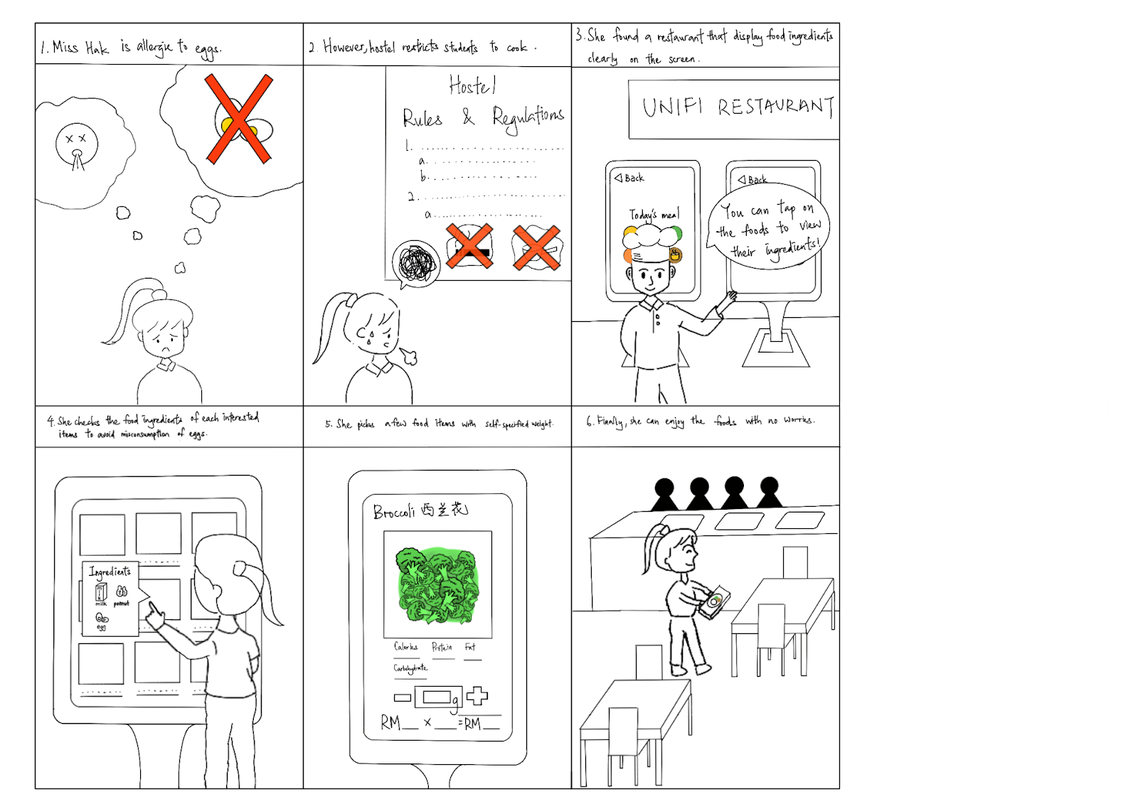
🔎 Introduction:
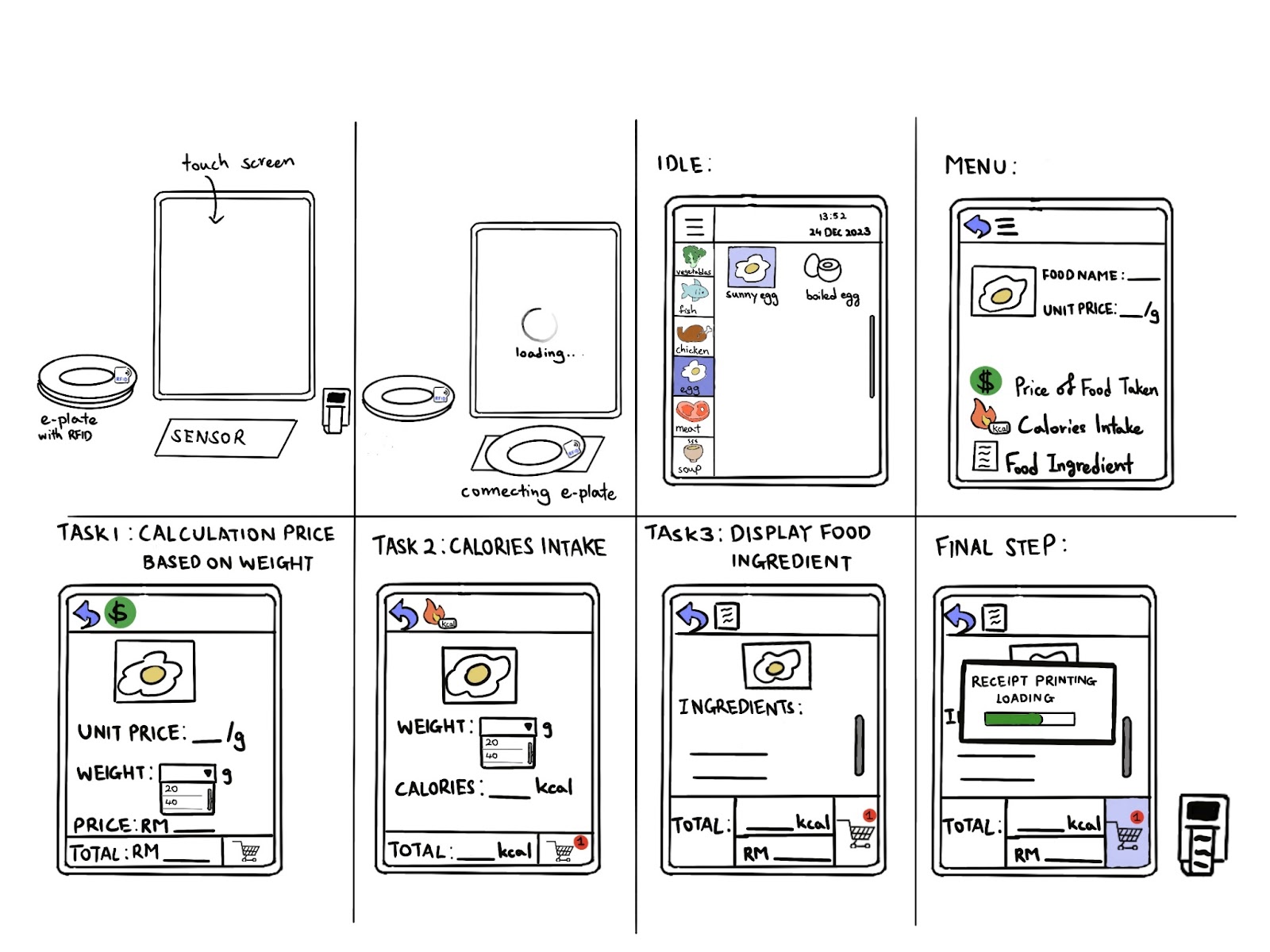
The 'E-plate' is an innovative product that integrates a touch screen display, a scan zone, and a central component with RFID installation, revolutionising the dining experience. The prototype streamlines order customization through an intuitive touch screen interface, simplifying the process for users. The scan zone ensures efficient detection of the 'E-plate,' allowing a smooth transition from order placement to food collection without the need for a printed receipt, promoting sustainability. The user-friendly interface, resembling familiar food-ordering machines, ensures an easy learning curve. The system includes features such as food weight customization, calorie detection for informed dietary choices, and an ingredient view function, enhancing user control and health-conscious decision-making in a comprehensive and efficient manner.
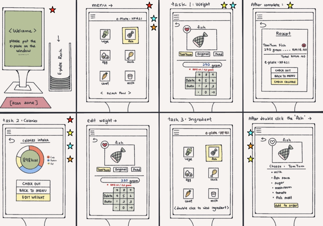
☝🏻Task 1
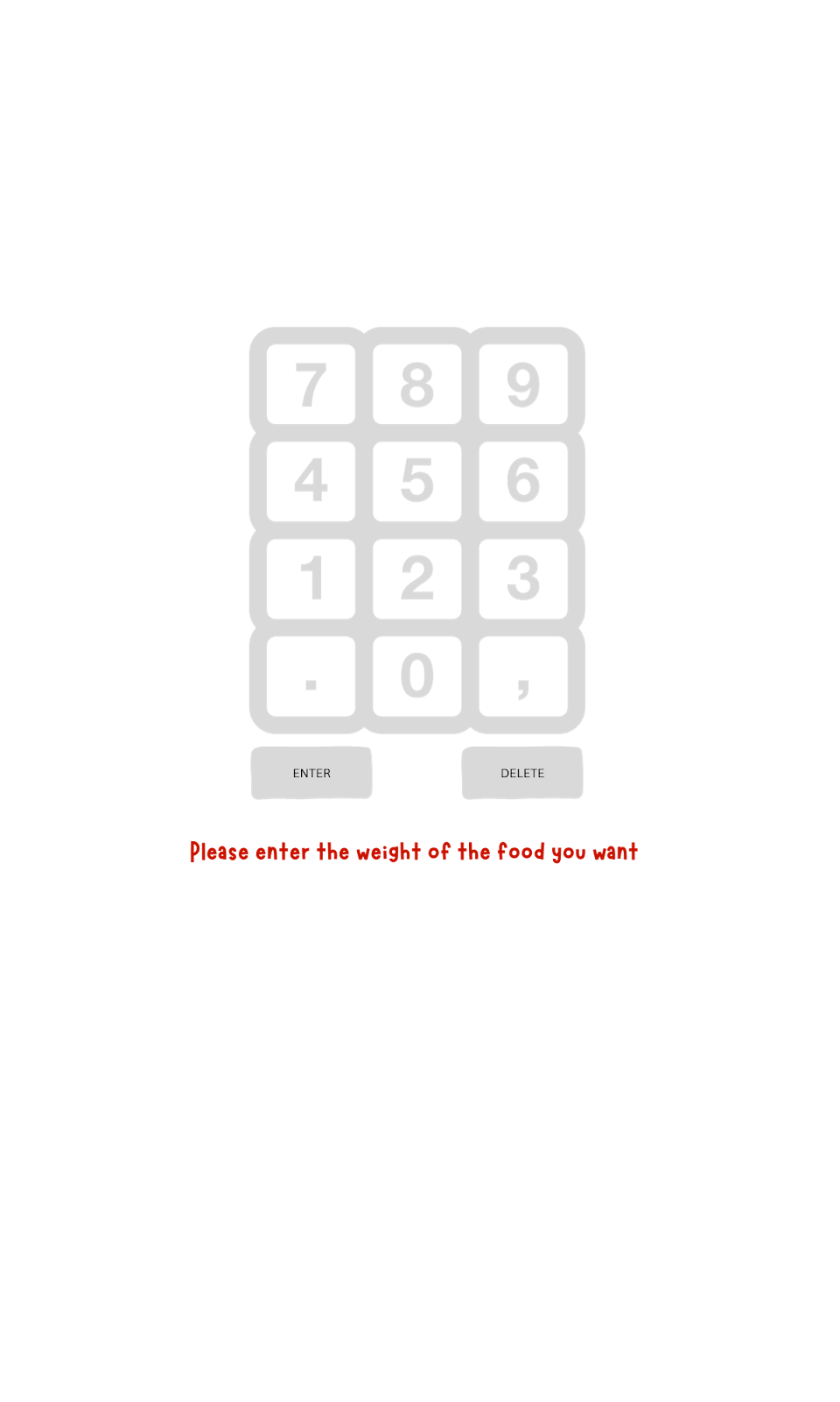
Customize the weight of the food product
✌🏻Task 2
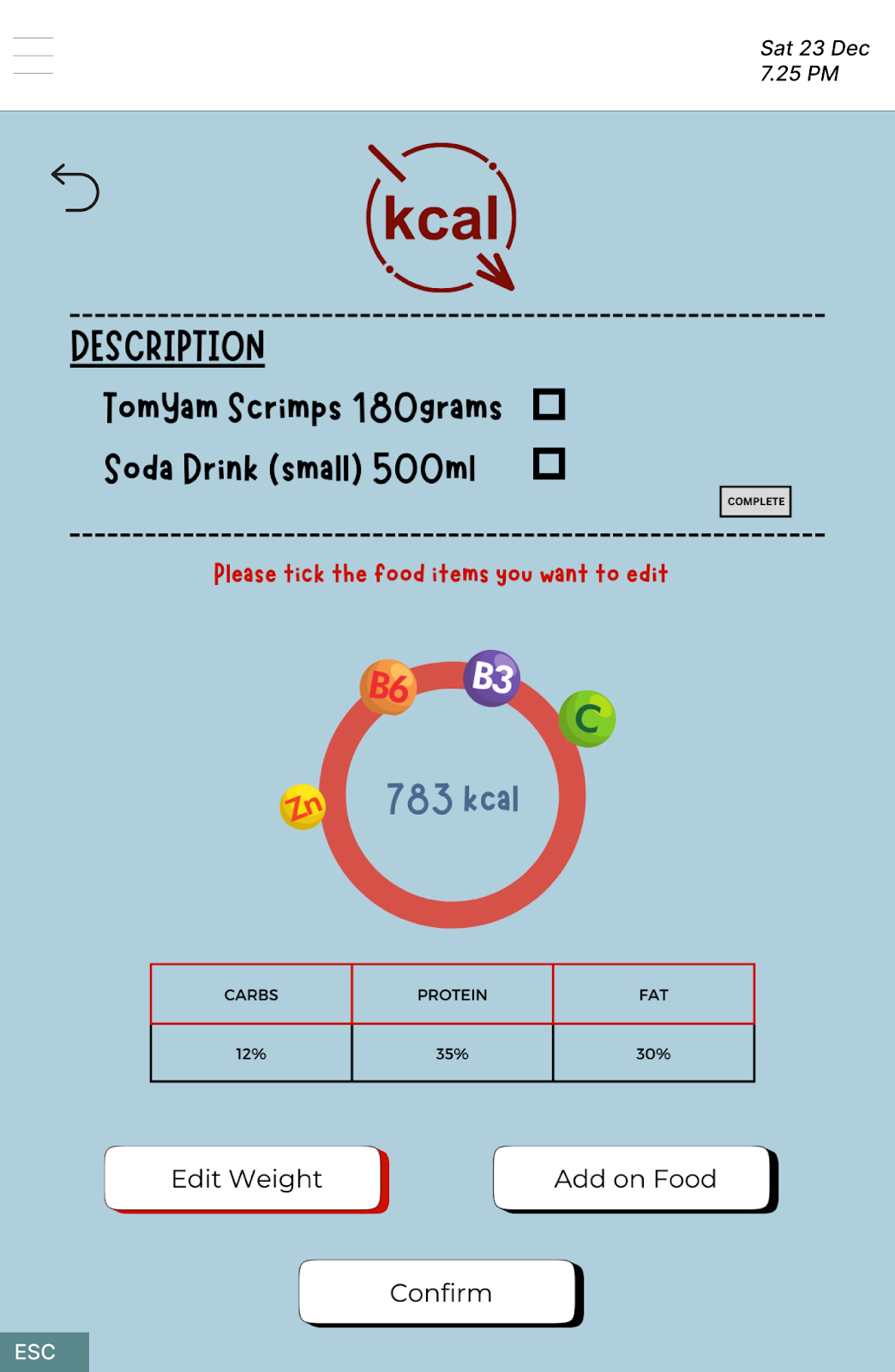
Observe the calories contain in food product
👌🏻Task 3
- View the food ingredient of our food product
In this project, our group is tasked with constructing a prototype for our proposed application and subsequently conducting usability testing to identify any issues in the user experience based on feedback. Usability testing is scheduled at MPK 3, N28, from 10 am to 1 pm. Additionally, we conducted usability testing in the N28 lobby from 4 pm to 7 pm。 In total, the participants involved in the usability testing were mainly our coursemates, with an additional three participants from other courses. For usability testing, we are using our own laptops to perform the prototypes. To provide users with a better understanding of our prototypes and the product, two other objects are employed to represent the e-plate and scan zone, respectively. The users will start testing the prototypes after a briefing from us. They will attempt to complete the given tasks while our group members take notes and record the problems faced by users.
User Testing Video 🎬 🎥
User 1: Student 👩🏻🎓🧑🏻🎓
Conducted by: GOH ZI QIN
Edited by: GOH ZI QIN
User 2: Fitness Enthusiasts 🏋🏻 💪🏼
Conducted by: WONG SHI QING
Edited by: WONG SHI QING
User 3: Food Allergy Sufferer 😷🤧
Conducted by: HAK TAI HUEI
Edited by: GOH ZI QIN
🌸🌸🌸🌸🌸🌸🌸🌸🌸🌸🌸🌸🌸🌸🌸🌸🌸🌸🌸🌸🌸🌸🌸🌸🌸🌸🌸🌸🌸🌸
Prototype and Design 👩🏻💻👩🏻💻
Prototype Link:HCI_Eplate


🌸🌸🌸🌸🌸🌸🌸🌸🌸🌸🌸🌸🌸🌸🌸🌸🌸🌸🌸🌸🌸🌸🌸🌸🌸🌸🌸🌸
Briefing Notes📖
Prepared by TAN SIN YI
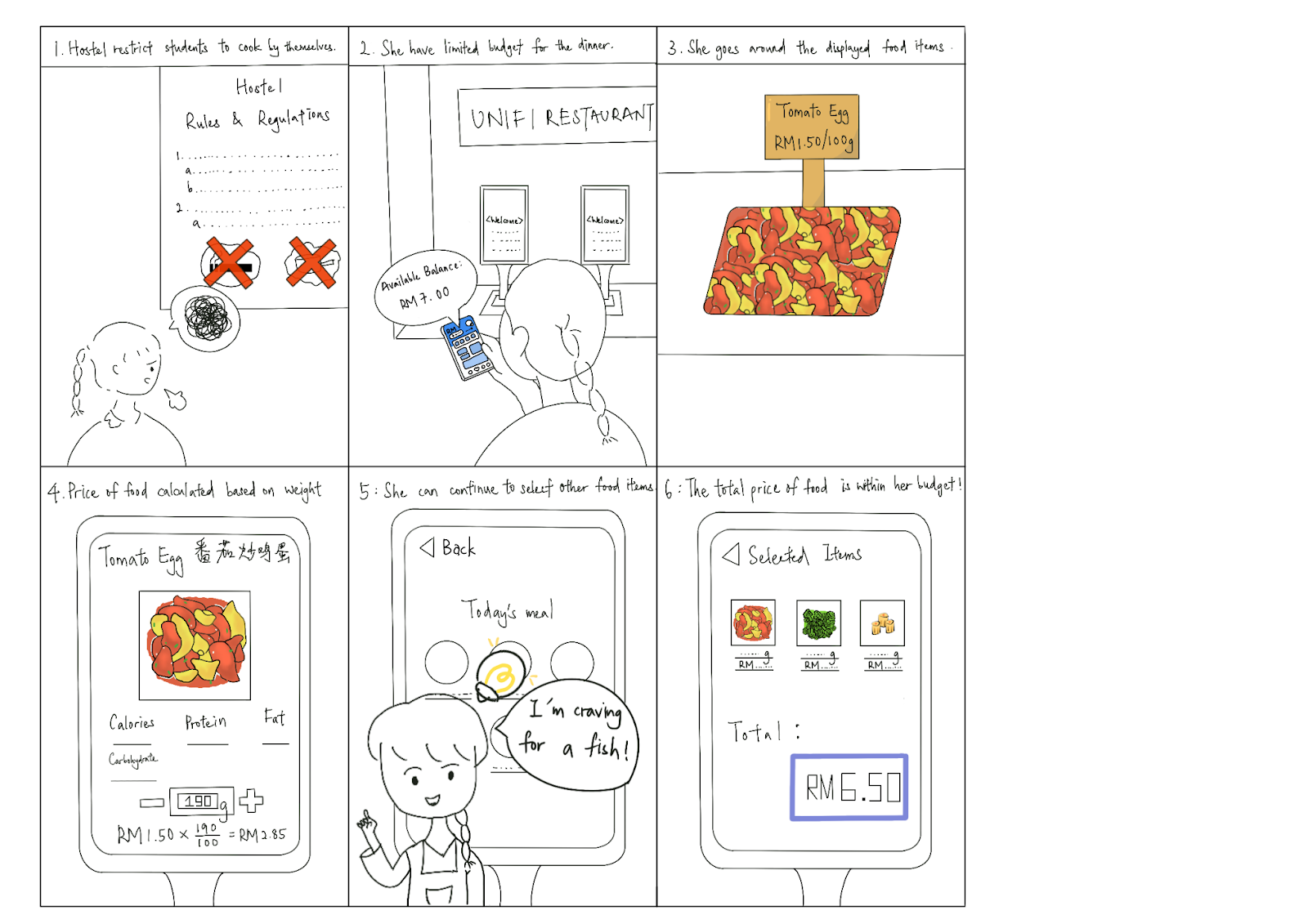
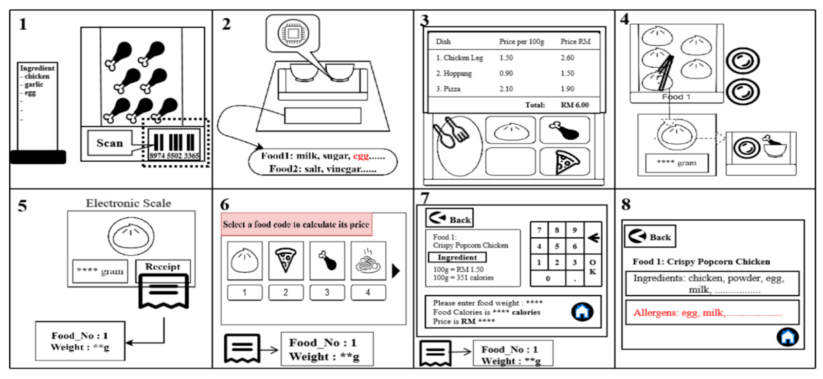
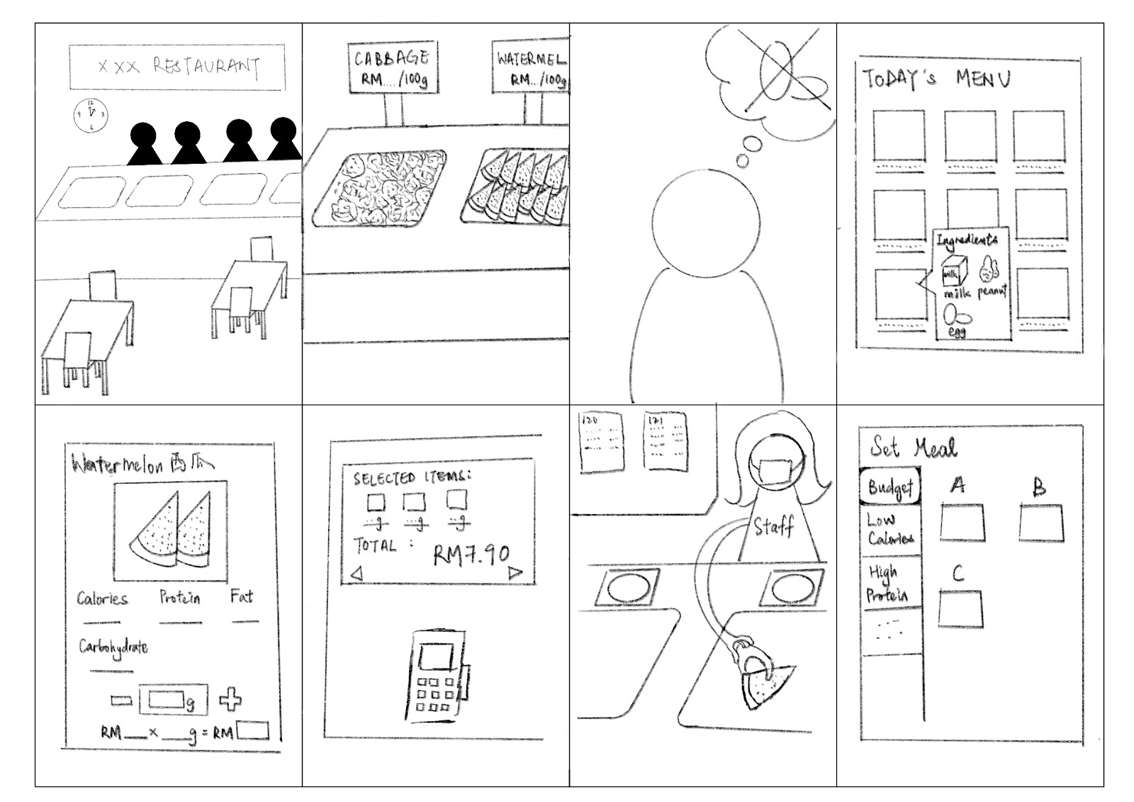
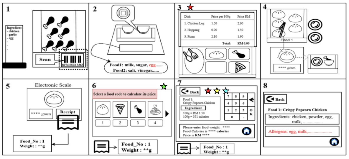
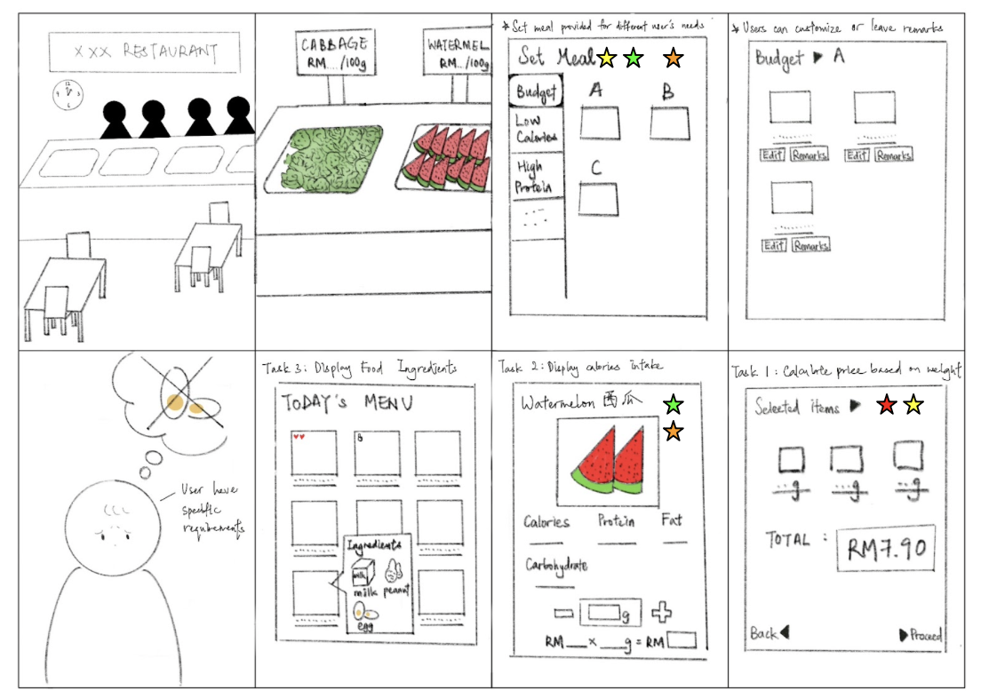
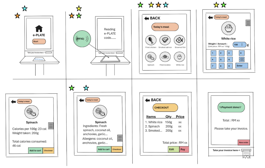
Good morning, Sir/Miss. For now, we would like to brief you about the purpose and background of our product, called e-plate. It is a plate that incorporates RFID technology, offering three main functions: calculating the price of food items based on their weight, determining the calorie content of each food item, and displaying the food ingredients.
Currently, inconsistent price control in the catering industry, especially in mamak stalls, has become a hot issue in Malaysia. Many people are dissatisfied with the opaque method of calculating food prices in mamak stalls. Additionally, we have identified that a lack of dietary control and nutritional information leads to various health problems, such as high blood pressure and diabetes. Moreover, inadequate transparency in food information can be a significant issue, potentially causing individuals with allergies to unknowingly consume allergens. These are the primary reasons why we decided to develop this product.
Do you currently have free time to conduct user testing for this product?
1️⃣ Task 1
Customise the weight of the new food product and check it out
- You often prefer the meal that fits your budget. Customize the weight of the new food product to see how this feature can offer you the flexibility and affordability in your meal choices.
2️⃣ Task 2
Observe the calories contain in new food product
- Knowing the calorie content is essential for meeting your nutrition and fitness goal. Observe the calories content of the new food product to ensure it aligns with your fitness objectives.
3️⃣ Task 3
View the food ingredient of our new food product
- It is crucial to have transparency about the food ingredients that wish to intake. View the detailed food ingredient information to ensure the new food item is free from allergens.
🌸🌸🌸🌸🌸🌸🌸🌸🌸🌸🌸🌸🌸🌸🌸🌸🌸🌸🌸🌸🌸🌸🌸🌸🌸🌸🌸🌸🌸🌸
Testing With Users👥
Task1:
Prepared by WONG SHI QING
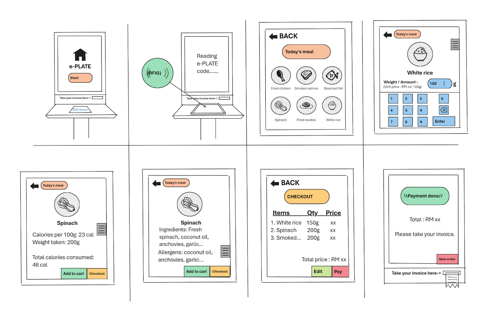
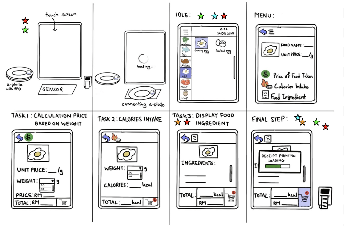
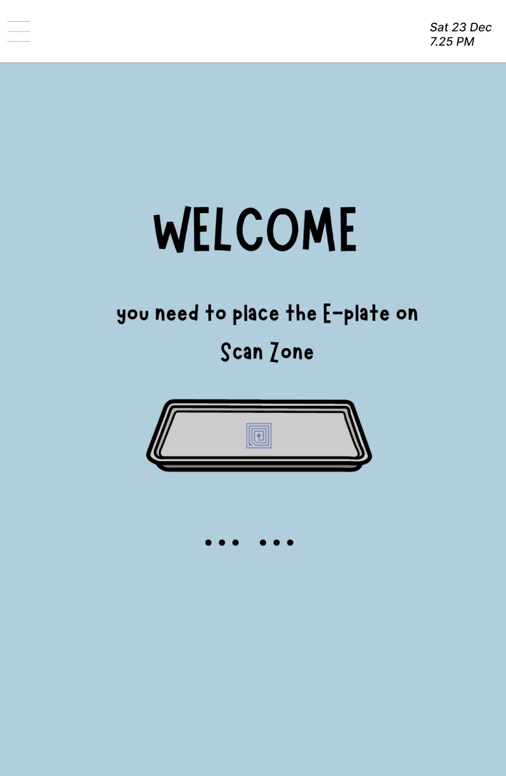
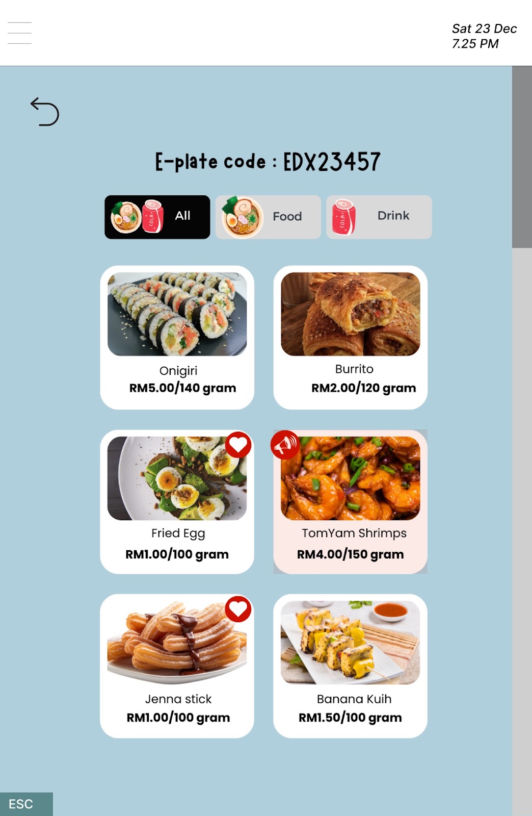
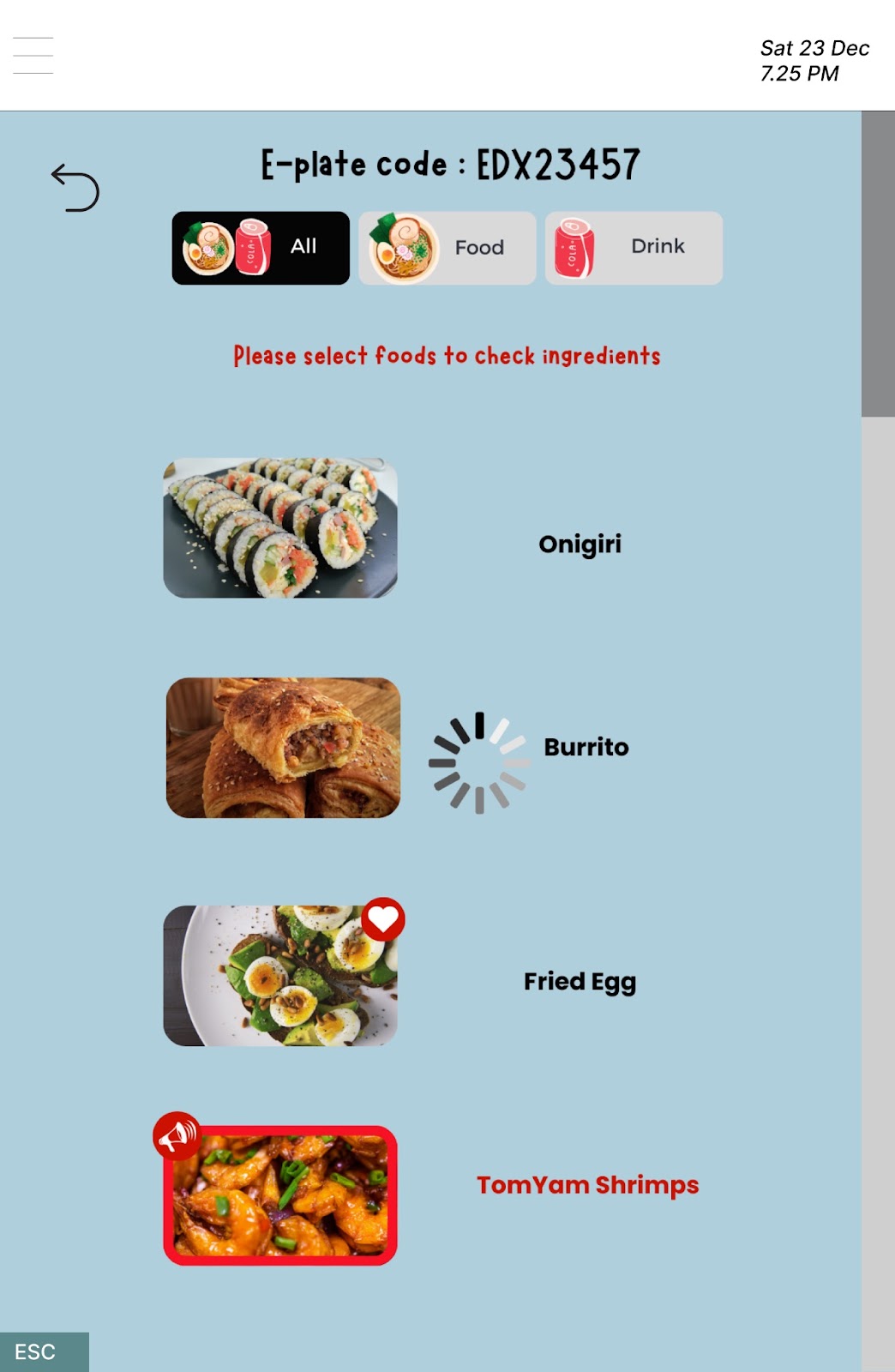
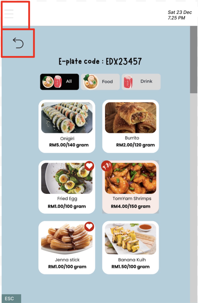
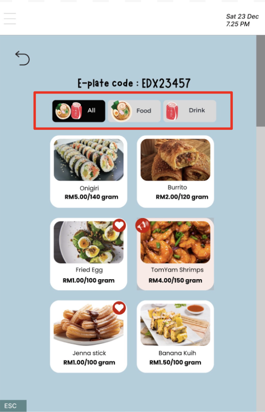
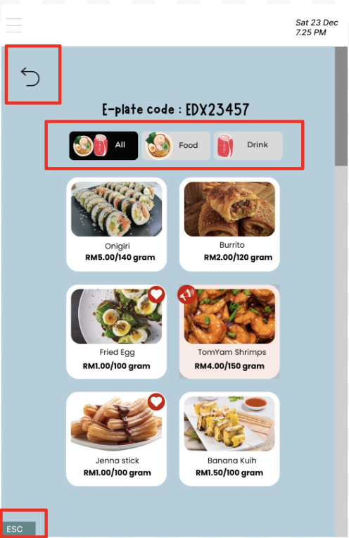
For the first task, we are going to observe the users customizing the weight of the new food product and check it out. The starting page is the welcome page of the products, which the users are instructed to place the “e-plate” on the “scan zone” before starting the usability testing of task 1. They looked like there was no confusion when placing the “e-plate” on the “scan zone” because the area is clearly mentioned. However, user 1 is a little confused as the screen has nothing changed or guide for the next step. Both user 2 and user 3 successfully click the screen to proceed to the next step.
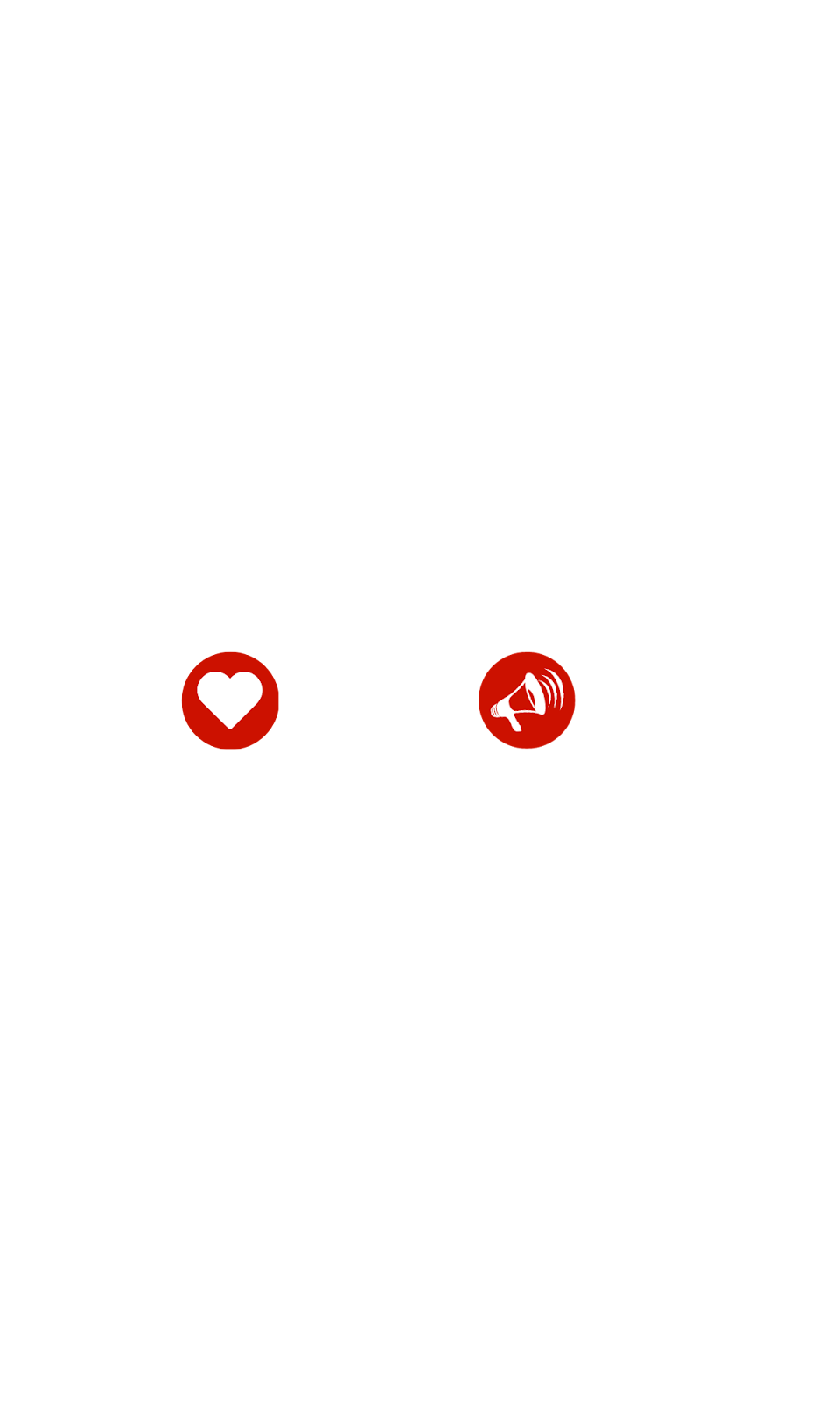
Then, there are two icons on some foods, which is a love and a speaker icon. User 1 expresses his thoughts that the love icon is food that is preferred by the restaurant while the speaker icon is the latest food in the restaurant. For user 2, he thinks that the love icon represents the recommended and healthy food in the restaurant, but not sure what the speaker icon represents. User 3 looks like didn’t notice the icons, she straight away chooses the food that she was interested in.
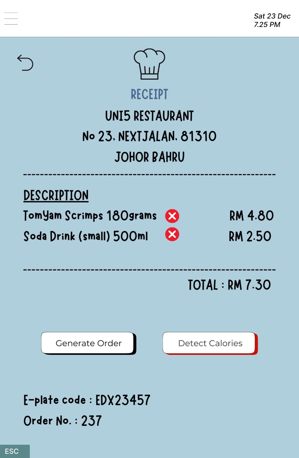
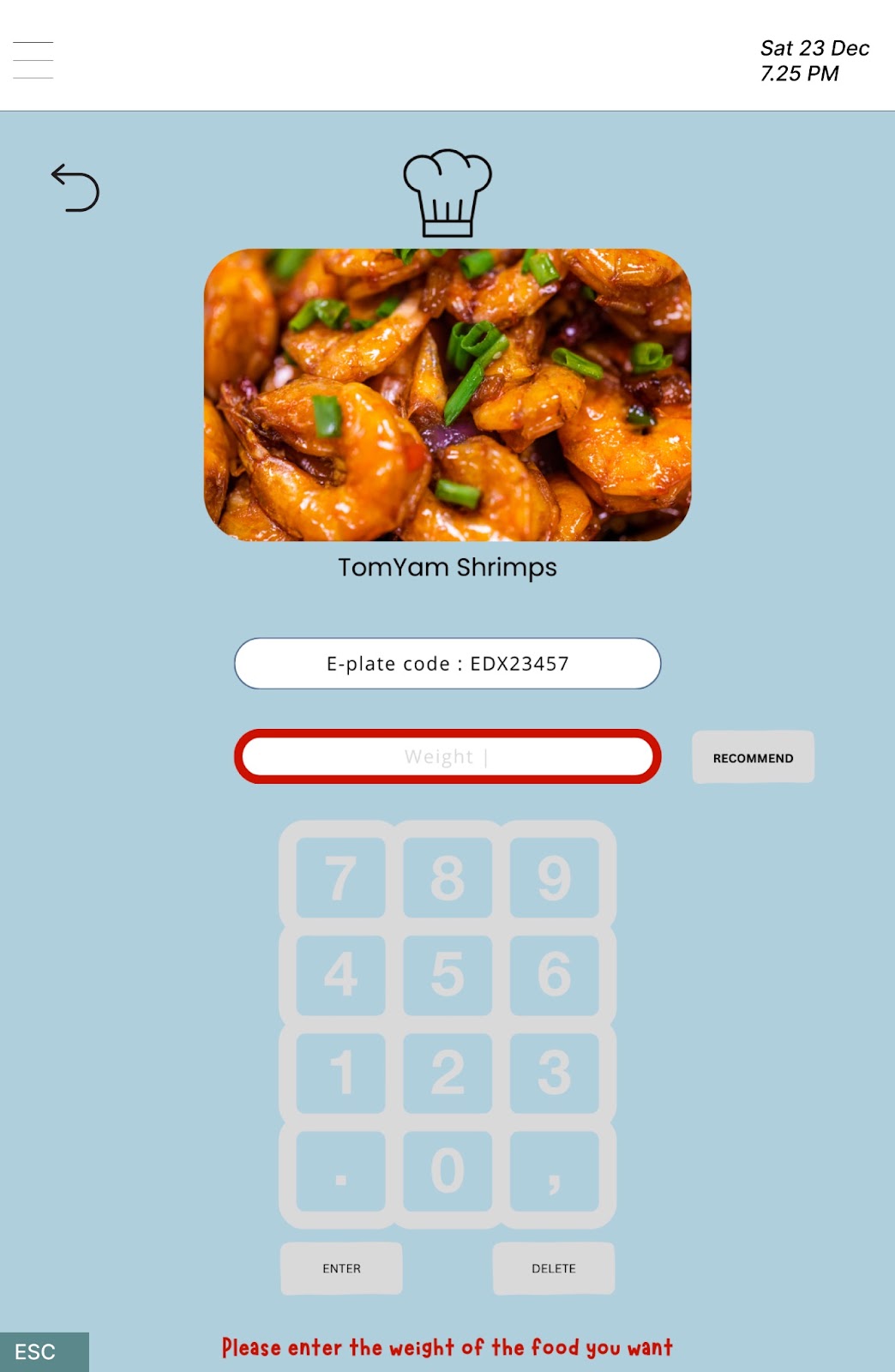
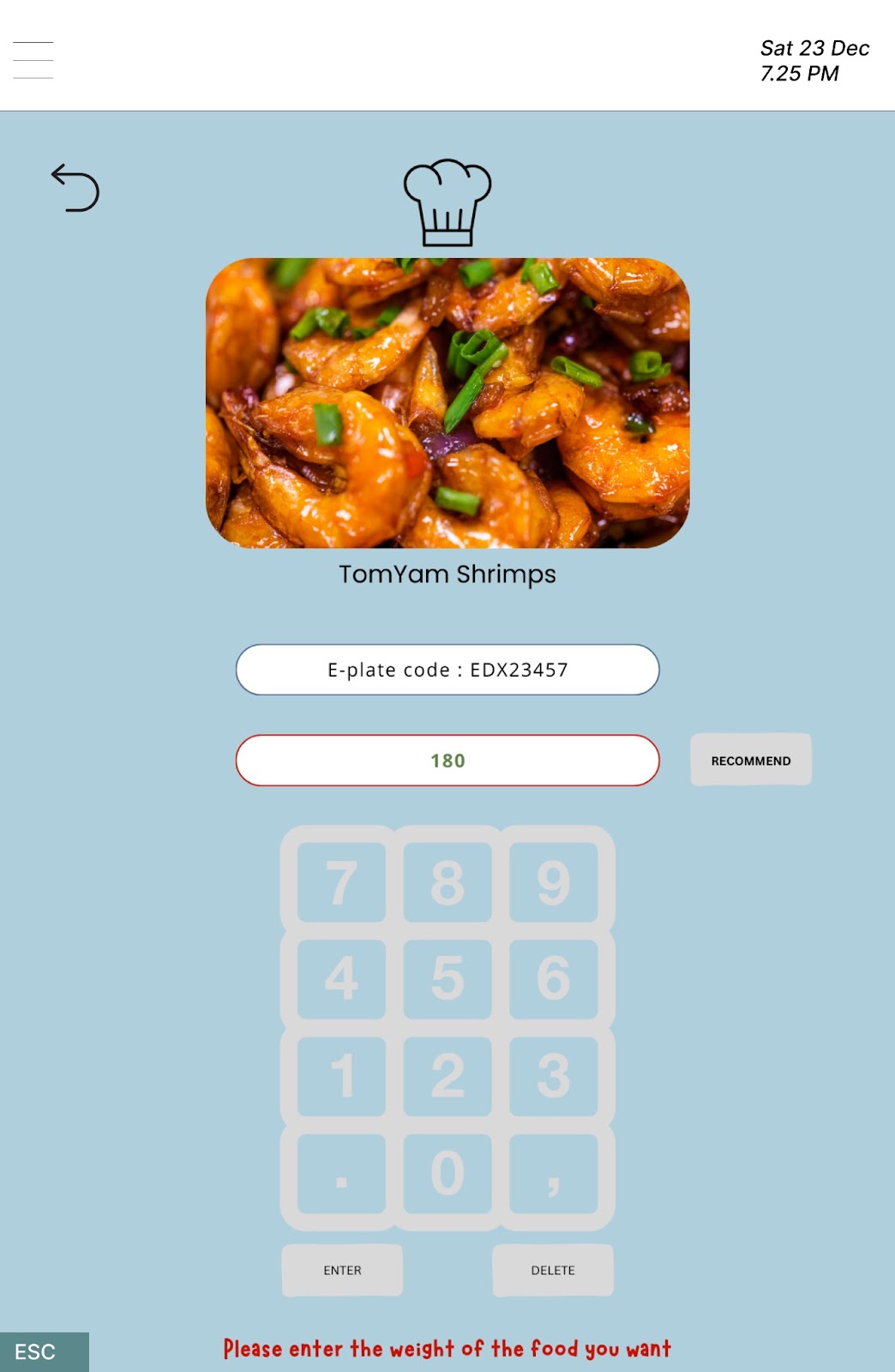
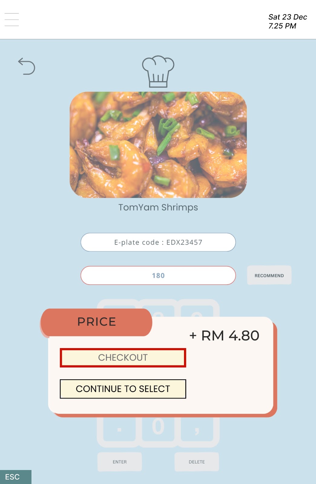
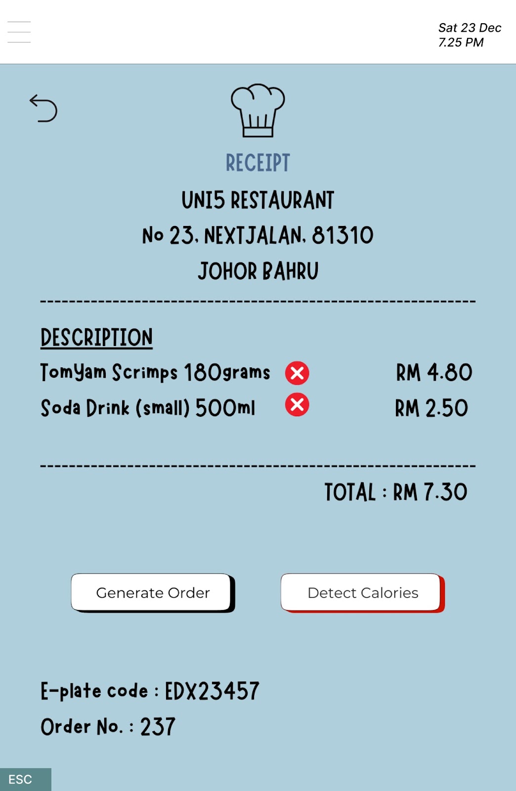
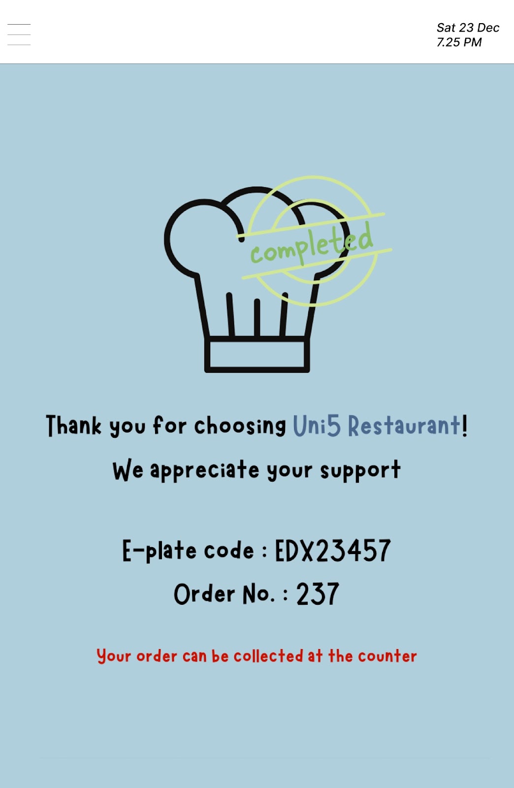
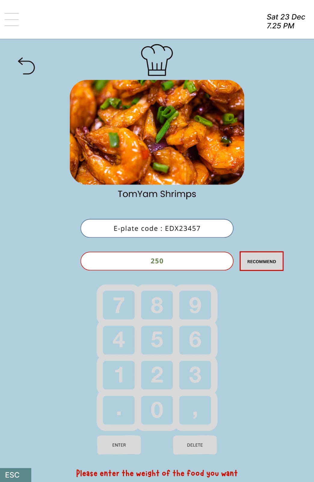
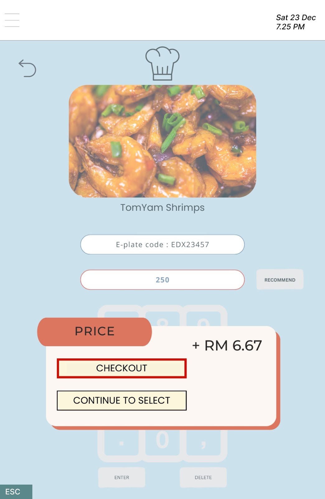
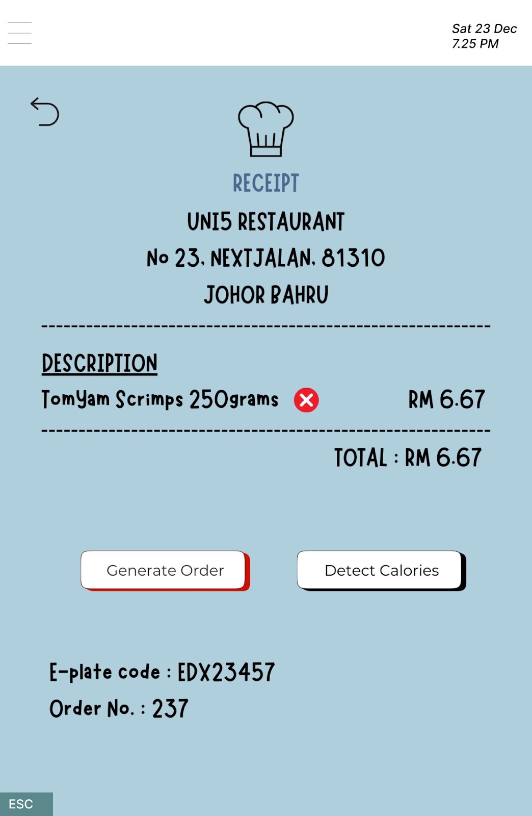
The three users choose different methods to customize the weight of food, like user 1 chooses the recommended weight while user 2 and user 3 choose to enter the weight by themselves. It can observe that the recommended weight is useful as someone does need it when they are choosing their foods. Next, the three users are able to click the “CHECKOUT” and “Generate Order” button smoothly after viewing the price of ordered food items. The reason for their fluent reaction may be the clear and obvious button, and the general flow that is similar to most products in the market.
Task2:
Prepared by YAP YEE JIA
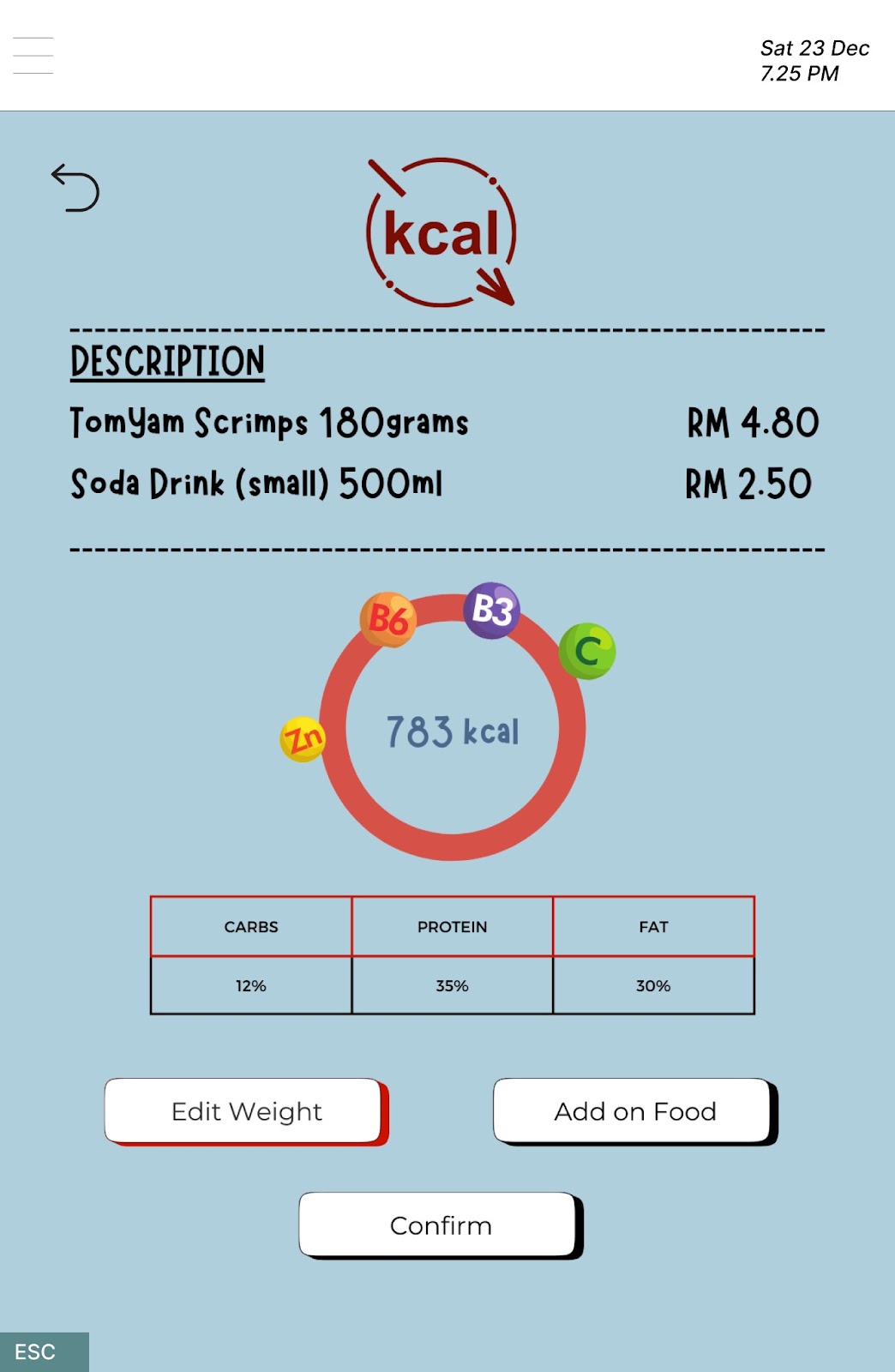
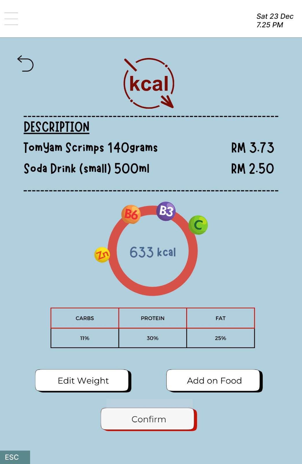
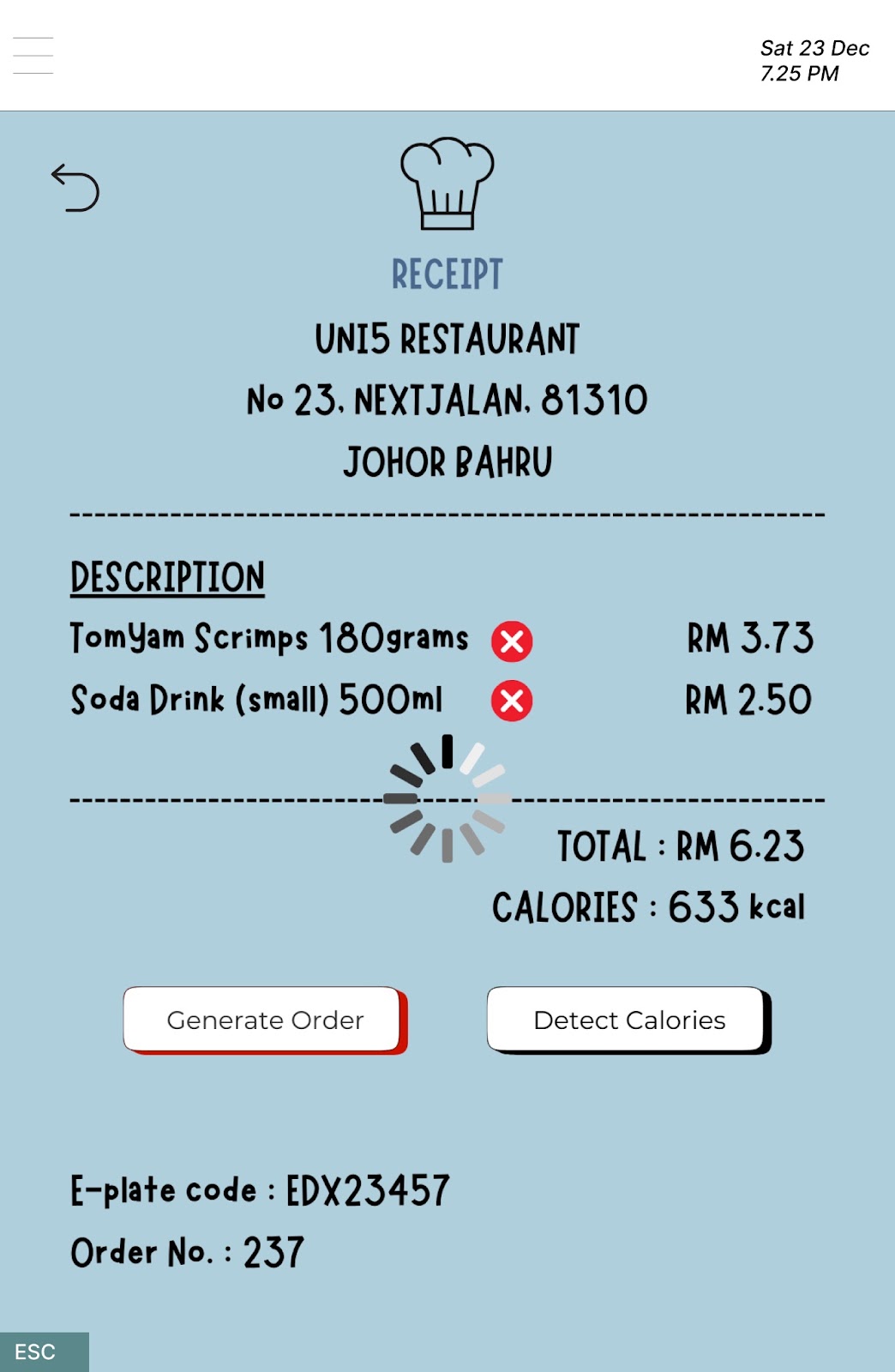
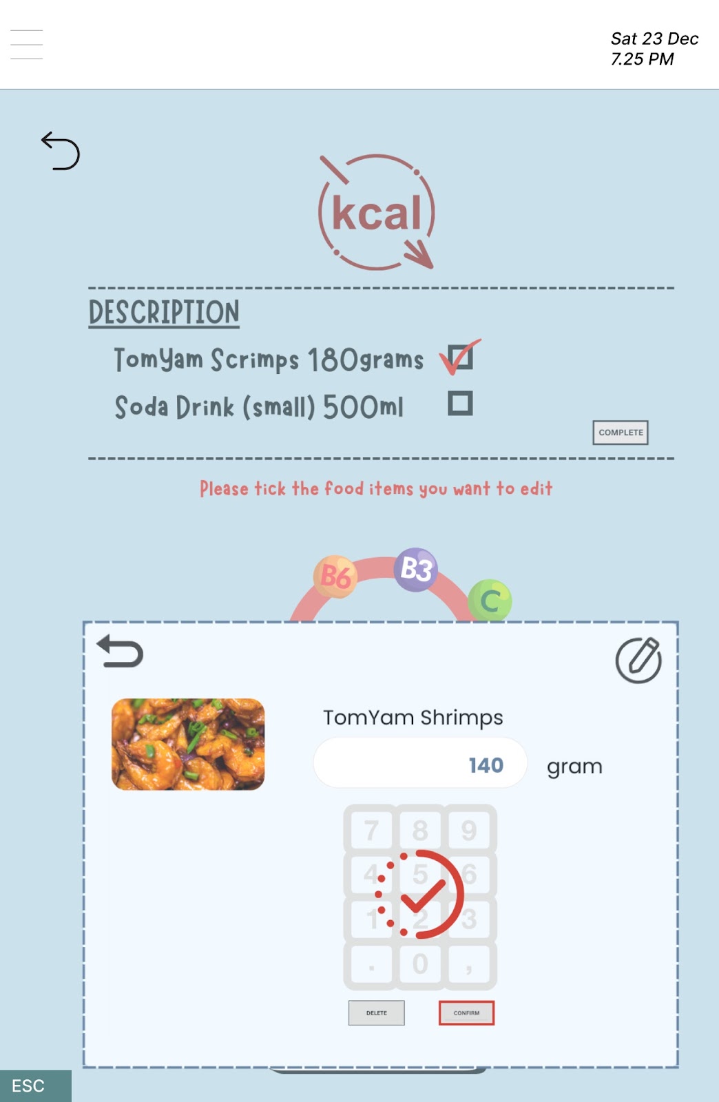
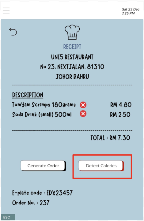
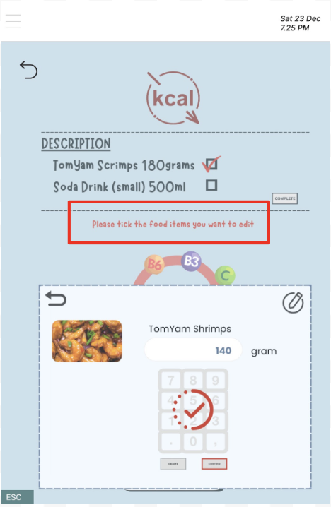
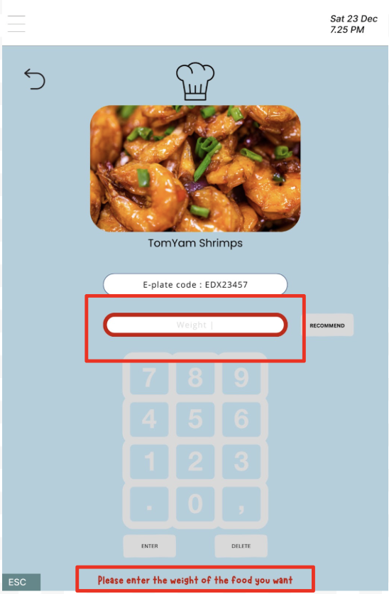
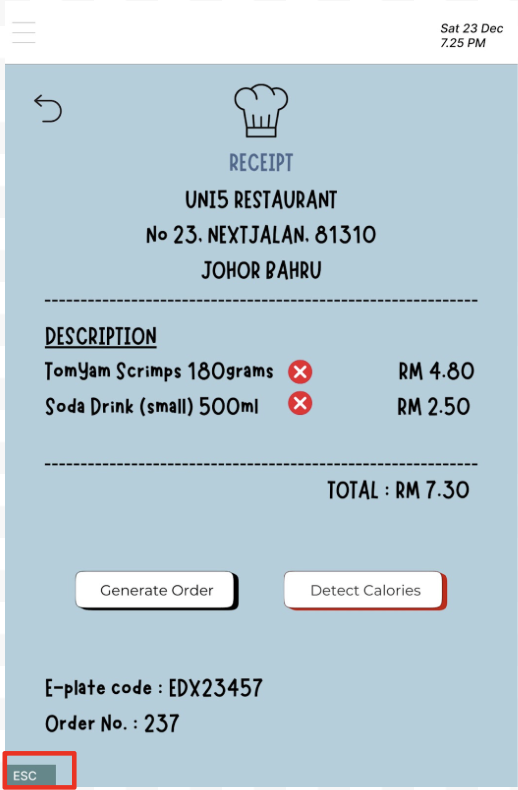
The second task is to observe the total calories of the meals selected and edit the weight of the Tom Yum Shrimps to modify the calories consumed. The users were instructed to carry out the task through our Figma prototype and expressed their thoughts and intentions throughout the usability testing process. All users began their task on a checkout page where certain food items are selected and await confirmation. They successfully found and clicked on the button to access the calories page as the name of the button, “Detect Calories” is clearly stated there. After reviewing the calories and nutritional information, all users proceeded with their task by clicking on the “Edit Weight” button to reduce the quantity of food ordered. From the list of food items chosen, the users know that they should tick the checkbox to choose the food item before editing its weight. However, some of them are confused by the “Edit Weight” button shown below and clicked on it when they should have clicked on the “complete” button to edit the weight of Tom Yum Shrimps. The reasons for this confusion are that the “complete” button is not visible to draw users’ attention and the “Edit Weight” button should not be appeared because it has no function in this weight editing page. After entering the new weight, a problem arose where the “Delete” and “Confirm” buttons were too small, prompting users to move closer to the screen to view the description clearly. At the end, all users successfully edited the weight of Tom Yum Shrimps and placed order by clicking the “Generate Order” button.
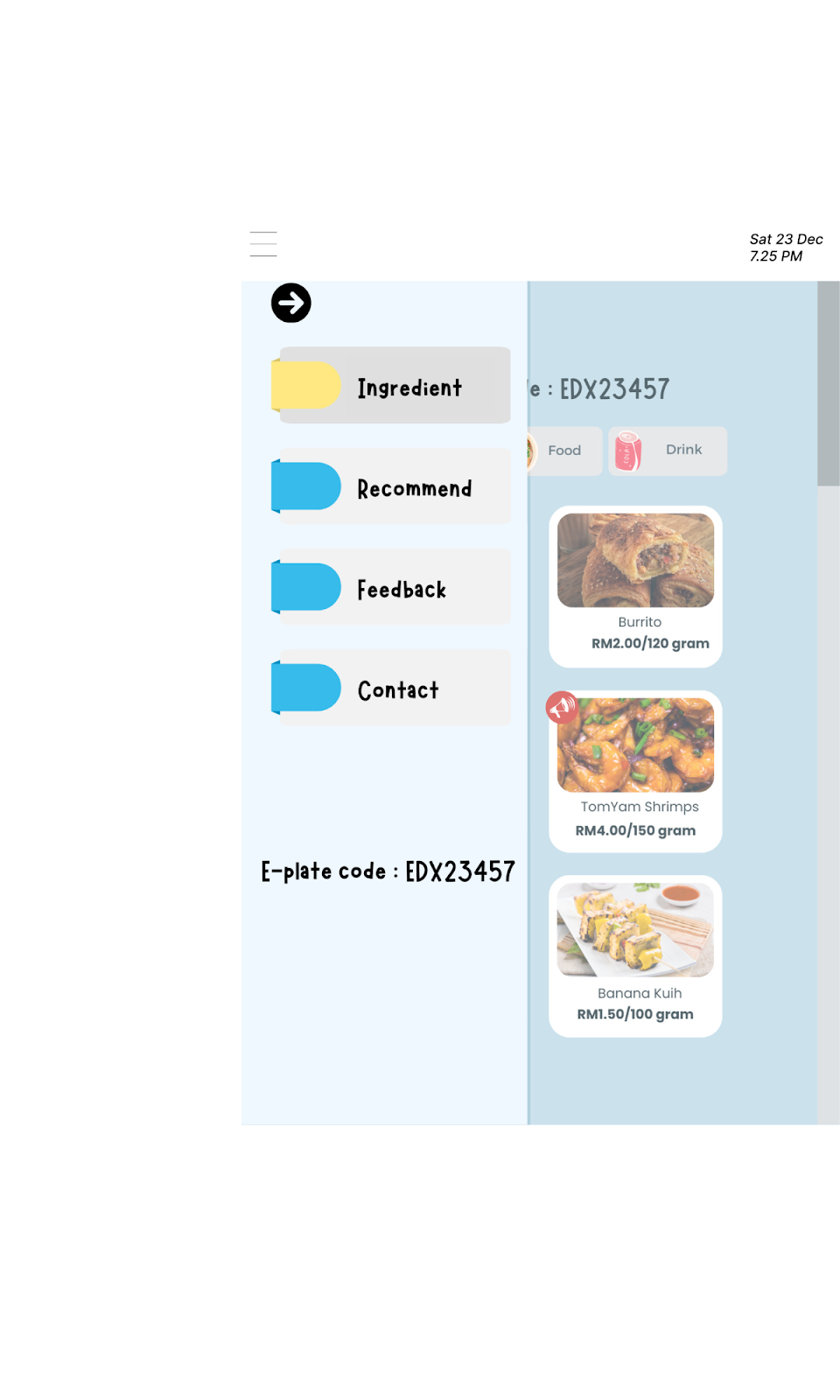
Task3:
Prepared by HAK TAI HUEI
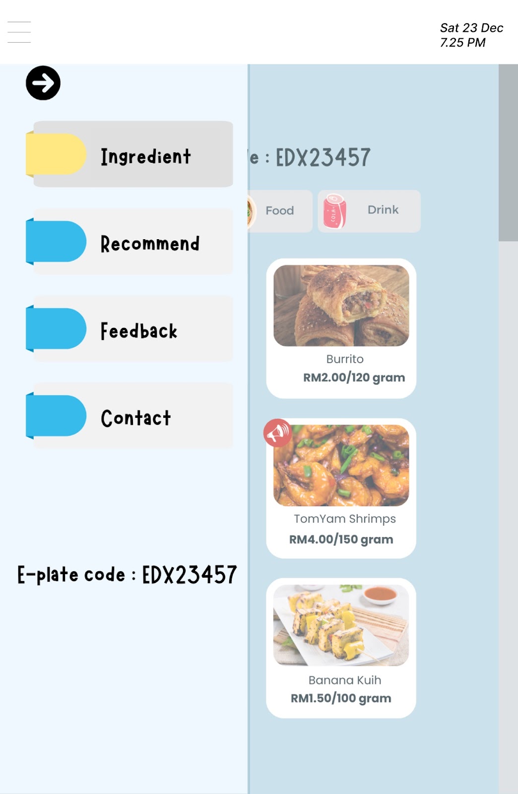
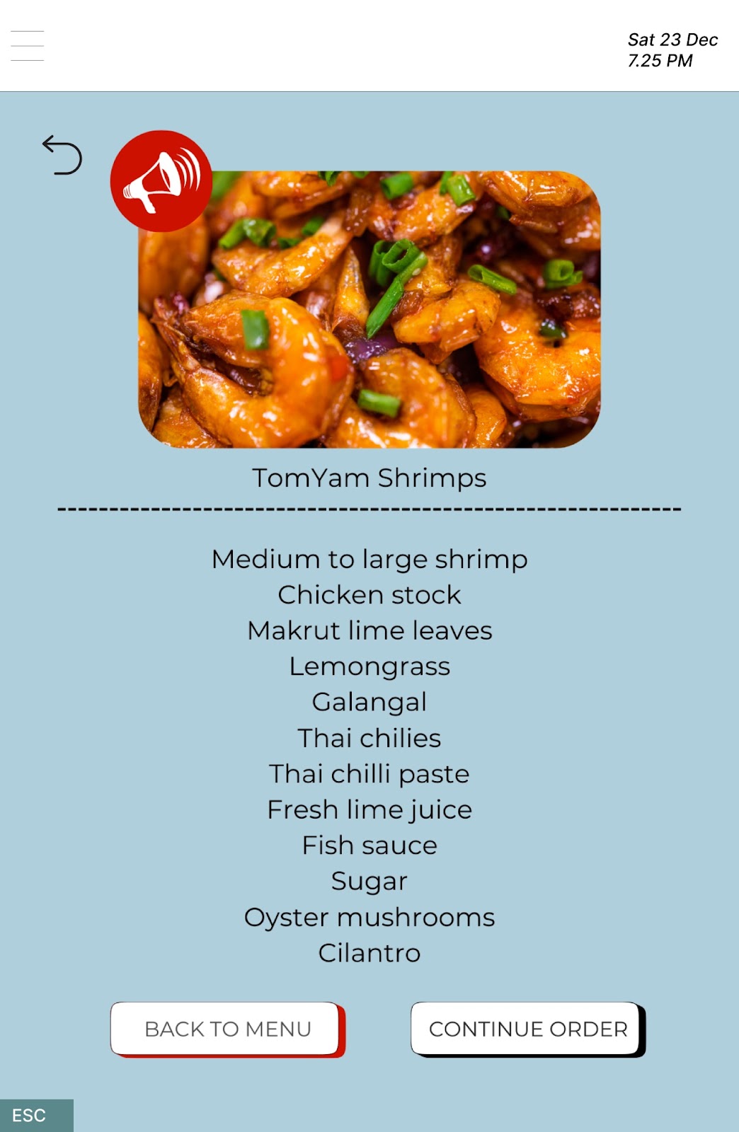
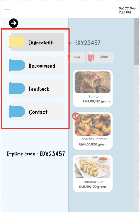
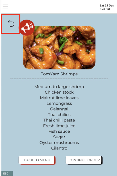
The third task involves viewing the food ingredients of our new product. To access the food ingredients, users need to start by clicking on the hamburger icon located at the top left corner of the page. Following this, they should select the bar labeled 'Ingredient,' and its food ingredients will be displayed upon clicking on any food item. For this task, we designated the main page, which is the menu, as the starting point for usability testing. During our observation of three selected users performing this task, we noticed that all users encountered a challenge at the beginning of the task and spent considerable time trying to find a way to access the food ingredients.
User 1 attempted to access the food information by repeatedly clicking on a food picture and long-pressing on the item, only to discover that it did not reveal the food ingredients. Likewise, User 2 tried clicking on the picture of the food item and attempted right-clicking, but still couldn't view the food ingredients. On the other hand, User 3 initially performed actions similar to User 1 and User 2. However, User 3 then attempted to click on the hamburger icon after noticing its flashing blue color when clicking elsewhere. As a result, User 3 was able to smoothly complete the task by continuing to click on the bar labeled 'Ingredient' that popped up and selecting the new product to view the ingredients of our new food product.
During the post-task interviews with the three users, all of them agreed that the third task was the most challenging. They pointed out that the hamburger icon in the corner of the page was a similar color to the background, making the icon appear transparent and difficult to identify. Additionally, no instructions were provided to guide users in navigating to view the food ingredients. It became evident that users faced difficulty in finding the correct method to access the food ingredients. This highlights a potential issue with the design of the food ingredient feature, indicating a need for revision to enhance usability.
Prepared by YAP YEE JIA
Generally speaking, most users commented that certain buttons and font sizes are too small, causing difficulty in recognizing the purpose or function of those elements. Besides, it was observed that the users are uncertain after putting the e-plate on the scan zone because there is no feedback indicating the users that the plate is placed correctly and successfully connected to the system. This left the users puzzled about whether they could proceed and what steps they should take next.
Task 1:
Specifically talking about task 1 testing, some of the users could not get the meaning of “recommend” beside the weight entry field. To address this, a clearer description should be written like “Recommended Weight”. The instruction “Please enter the weight of food you want” should be moved to top the weight entry field. Its original position at the bottom of the page is unjustifiable as most users may not notice it there. Furthermore, the pop-up window displaying the addition of price caused confusion among users, as they couldn't understand why the price shown in the pop-up window differed from the price displayed on the menu. Therefore, it would be better to eliminate the pop-up window and instead present order details, such as the price per food item chosen and the total order price, on a checkout page.
Task 2:
Since users have the freedom to determine the portion they would like to consume, the calories value varies for each order. If users wish to modify the weight of the food after reviewing the calorie content, they currently need to go through various steps such as clicking buttons and ticking checkboxes. To enhance efficiency, it is better to integrate the calorie observation function into the weight entry page, where the calorie content will be automatically calculated and displayed as users enter the weight. This allows users to make immediate changes by referring to real-time calorie calculations before adding the food item to their cart. As a result, it provides convenience to users, eliminating the need for extra steps to edit the weight of the food and modify the calories consumed. Additionally, we have decided to include some food items in sets, providing nutrition facts and calorie content directly on the menu.
Task 3:
This task proved challenging for many users, with some unable to complete it. The primary issue stems from users struggling to locate the gateway to view food ingredients, hidden within the side menu accessible through the hamburger icon. To address this, we decided to integrate this function directly into the menu. The users can long press on the food item to view its ingredients instantly. Clear instructions such as “long press to view ingredients of food” and “click to select food” will be displayed at the top of the menu, providing users with guidance on the next steps. Moreover, the menu of special sets will prominently display the ingredients and nutrition facts of each set meal. This ensures that the food allergy sufferers can easily identify and avoid items containing allergens before innocently adding them to their cart.
Result of Interview 🗣️
After conducting interviews with the three users who participated in our usability testing, the majority expressed satisfaction with our prototypes, highlighting their user-friendly and creative aspects. However, users also identified some usability issues and provided constructive feedback for potential improvements.
User 1, a student, noted that there is no initial message indicating whether the e-plate is successfully connected or not. From their perspective, the prototype should display a success message to prevent user confusion. Additionally, both User 3, a food allergy sufferer, and User 1 pointed out that the buttons and text are too small, making it challenging for users to identify. Consequently, these two users suggested that the buttons could have a different color or distinct shape and be made larger.
User 2, a fitness enthusiast, highlighted that in Task 1, the symbols we employed – the love icon and speaker icon – did not clearly convey the intended meanings of representing the most favorite food and the new food product. The user suggests using more familiar symbols to ensure users can easily recognize the meanings conveyed by the symbols we choose.
Furthermore, all three users commented on the difficulty of completing Task 3, which involves viewing food ingredients. They expressed a desire for a more user-friendly approach to make it easier for users to identify and complete the task. For example, User 2 suggests we provide some instruction or guidance for users to complete Task 3.
Moreover, most users found that Task 1 is the easiest to complete, as the steps are quite similar to other applications on the market. Hence, users can easily understand what to do to complete the task, such as choosing the food and editing the weight of the food.


