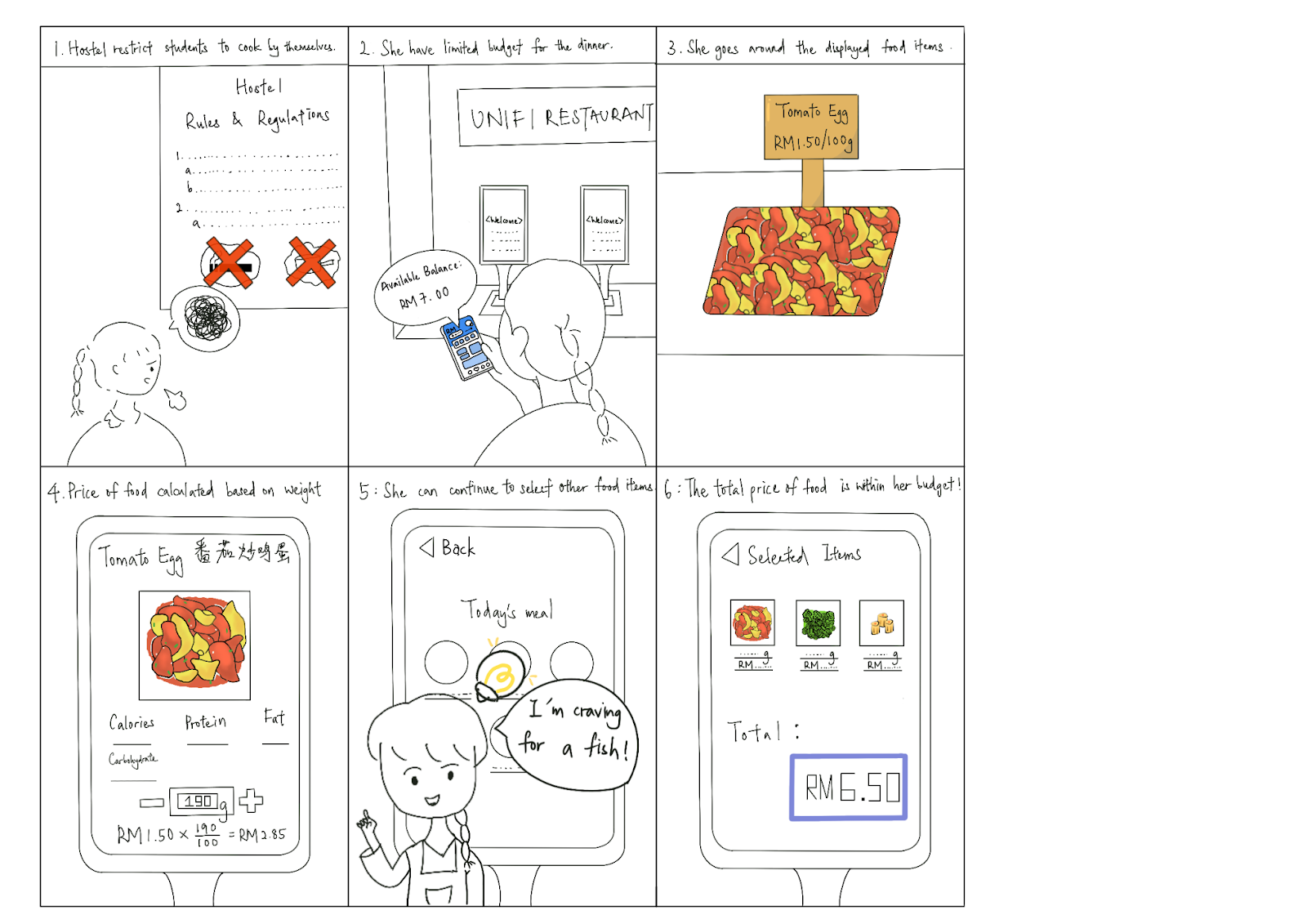
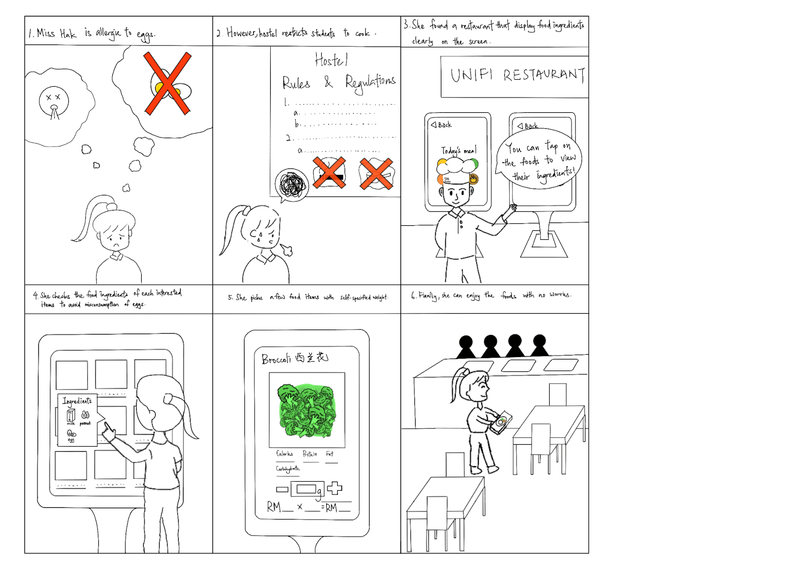
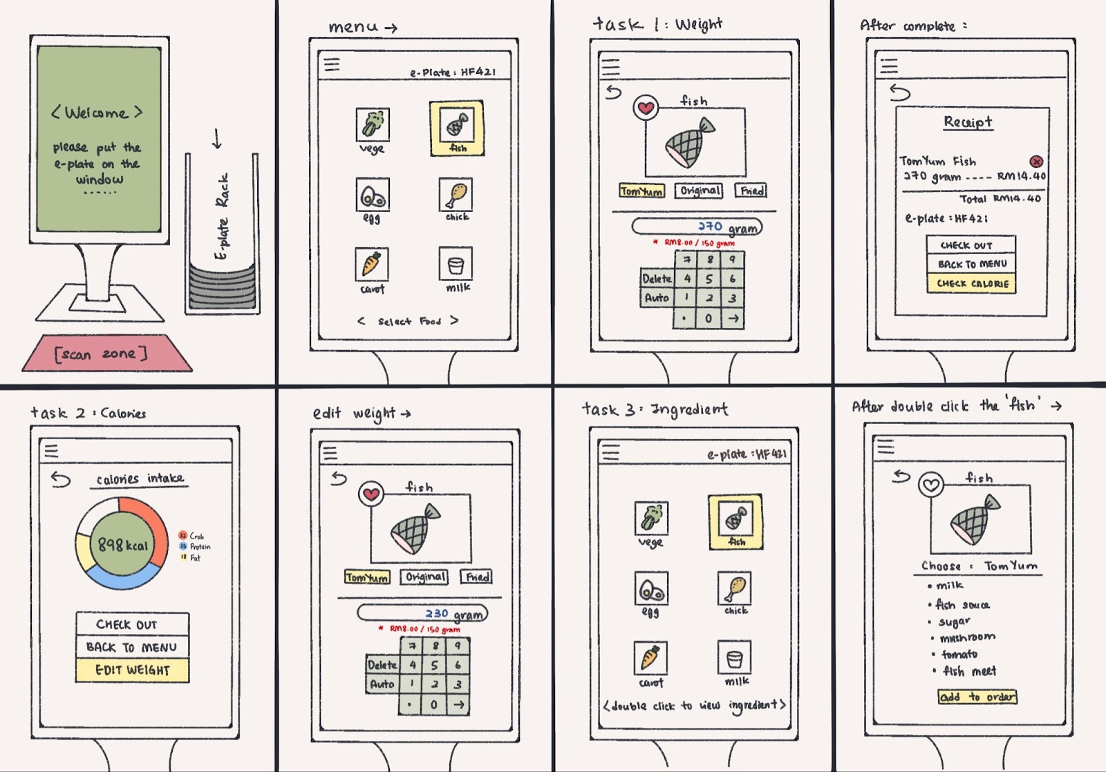
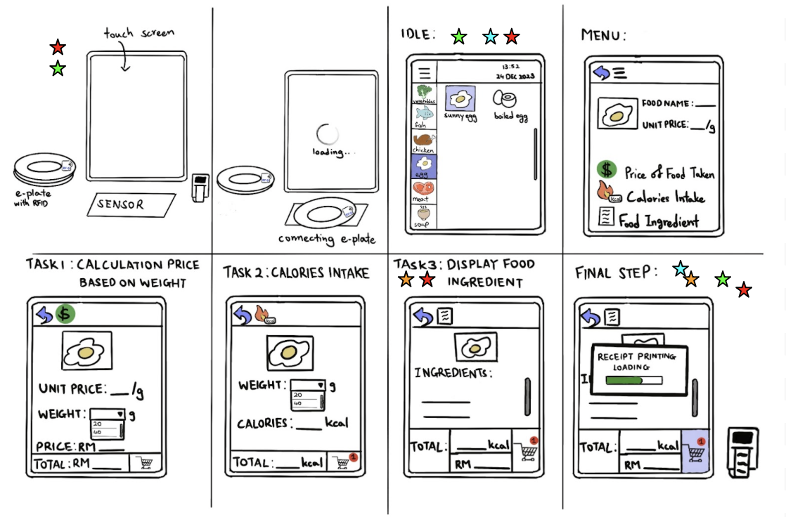
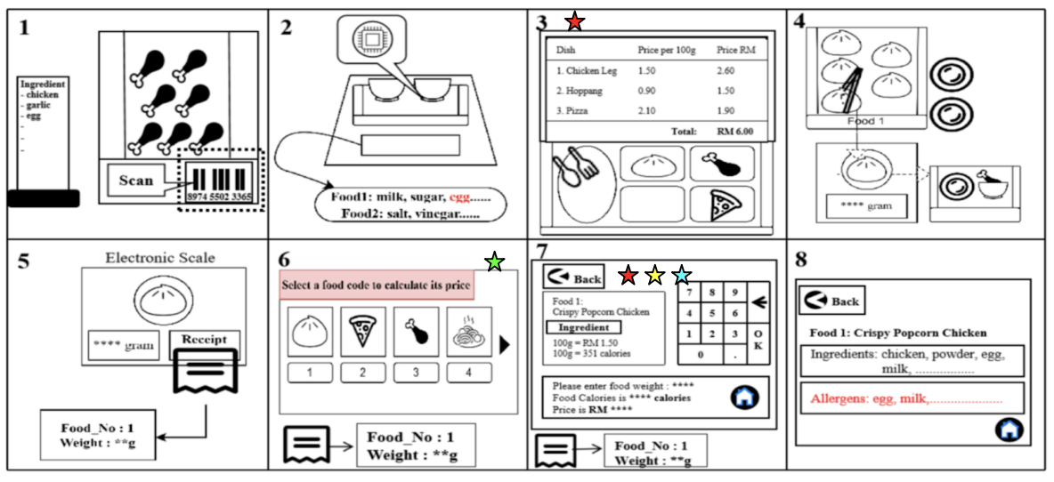
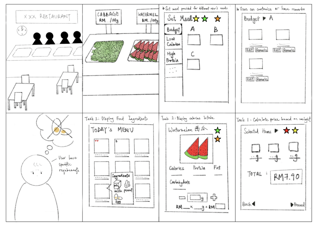
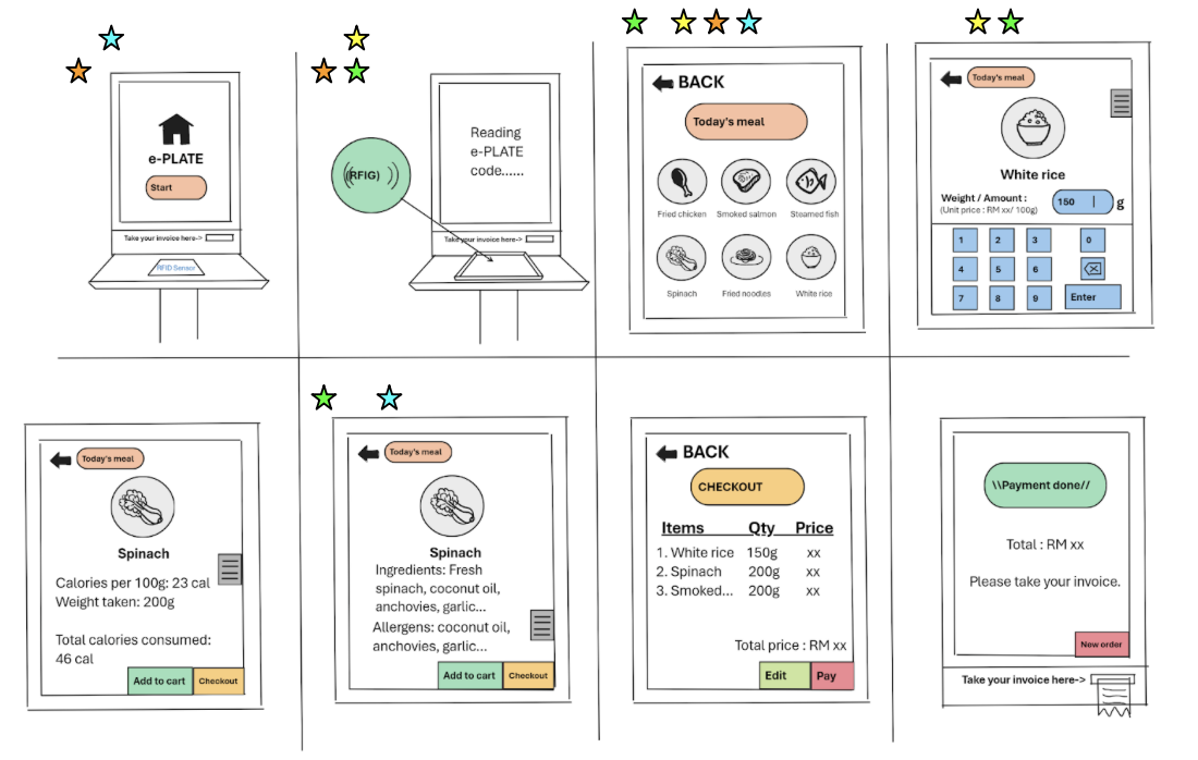
Storyboard
Task 1:
Task 2:

Task 3:
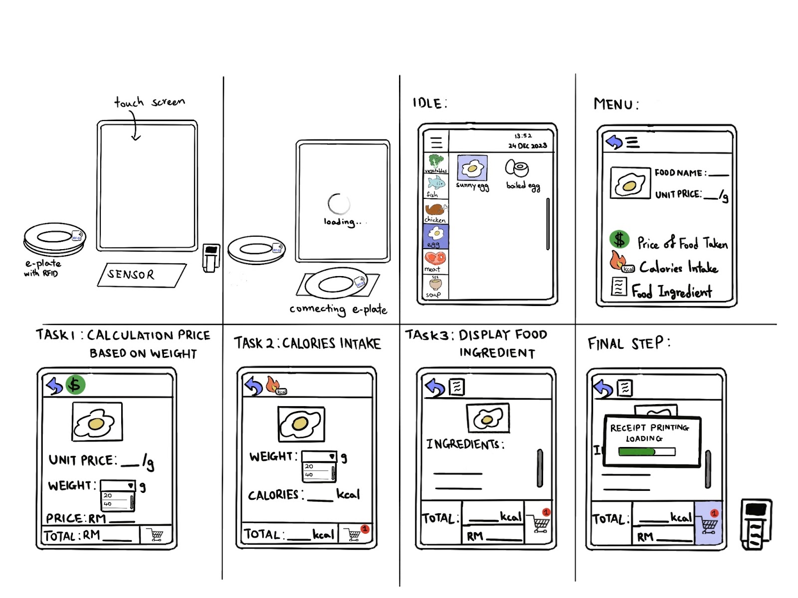
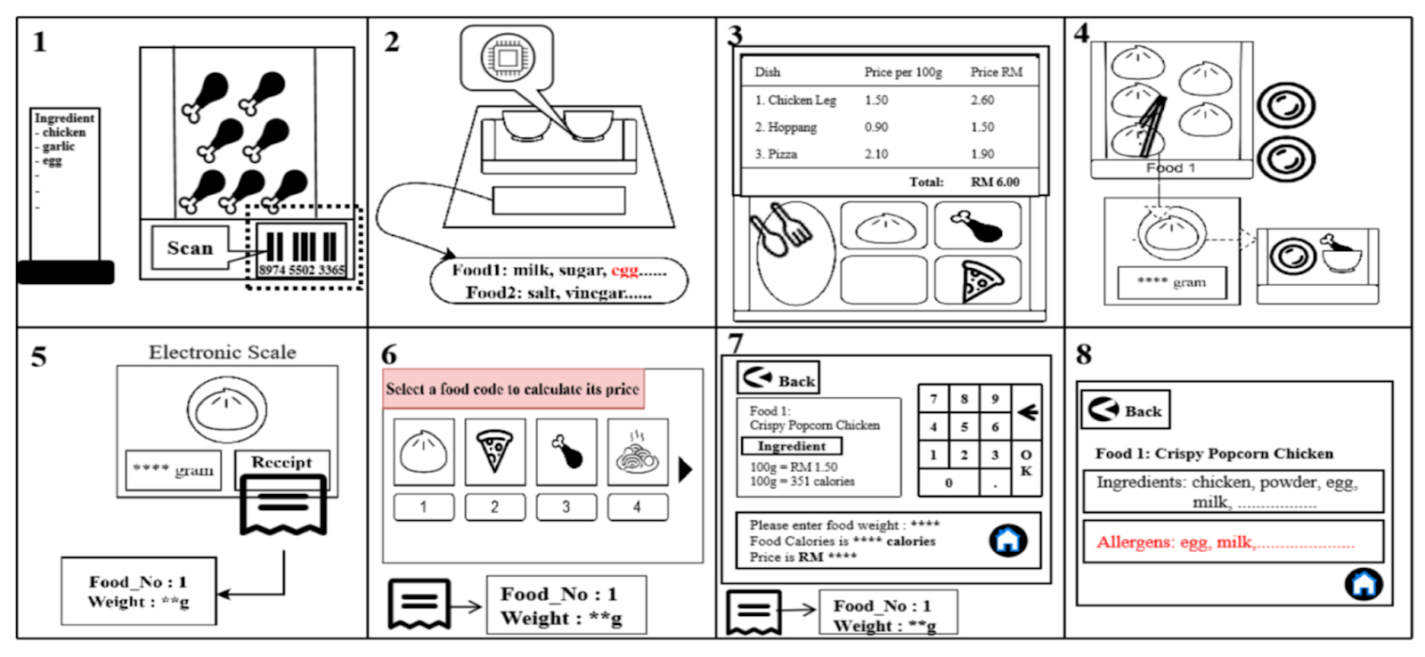
Alternative Design
by Goh Zi Qin
by Hak Tai Huei
by Tan Sin Yi
by Wong Shi Qing
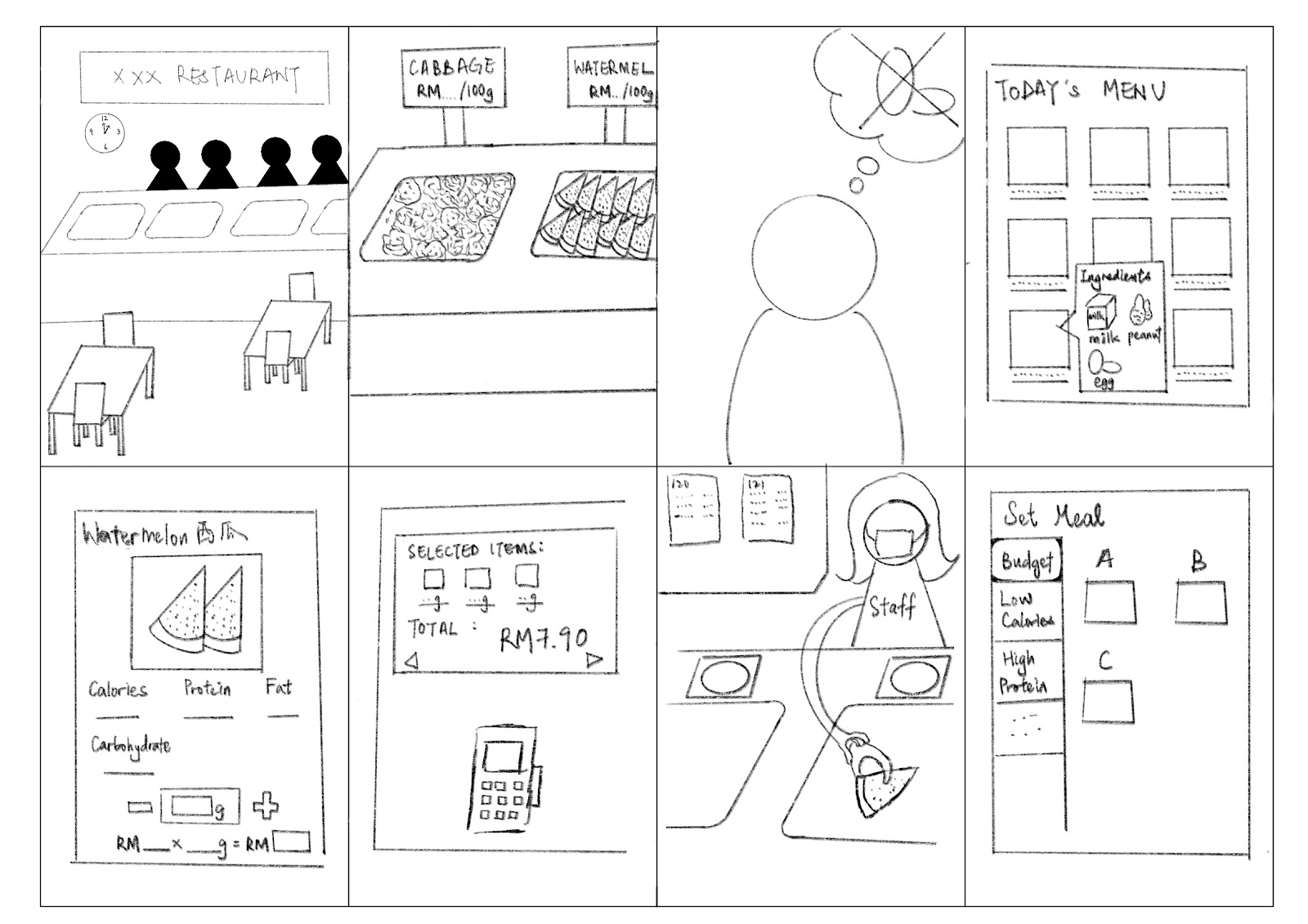
by Yap Yee Jia
Voted Design
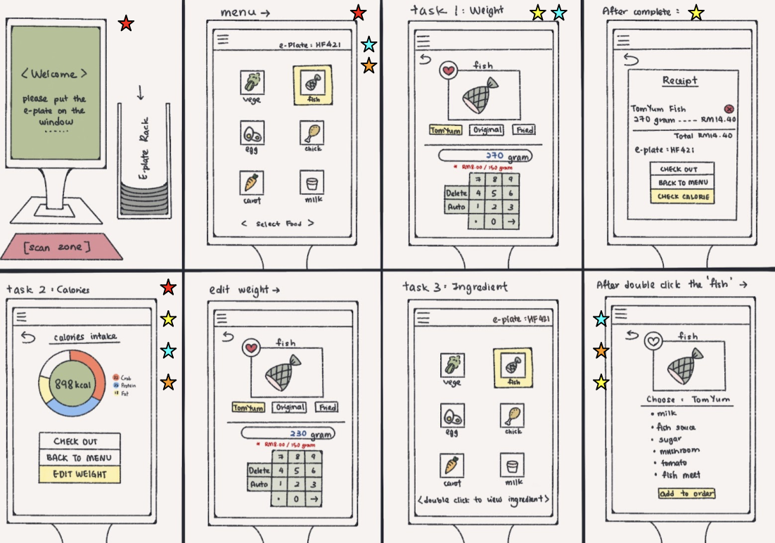
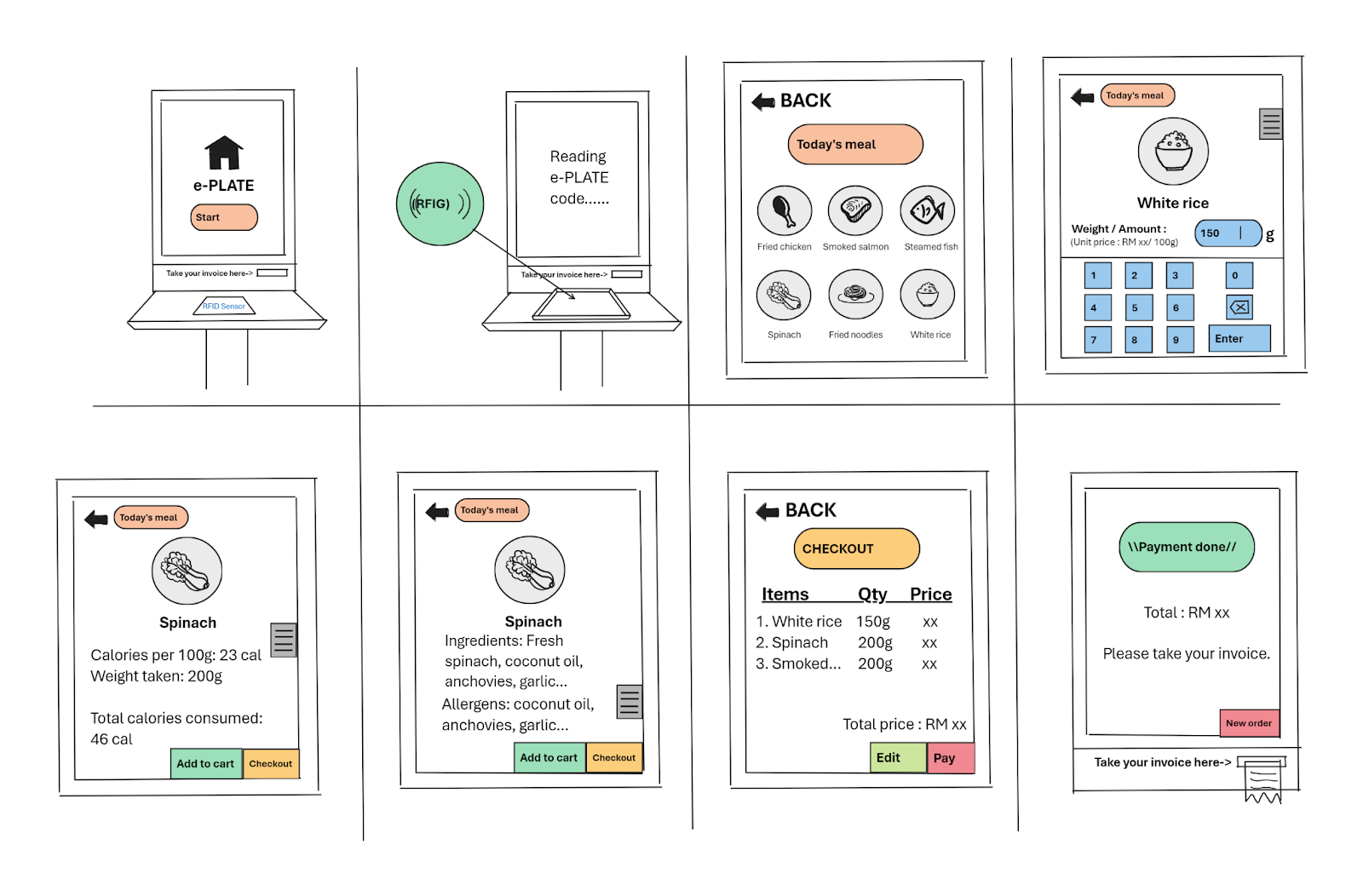
Wire Frames
Task 1:
Main Page Menu Page
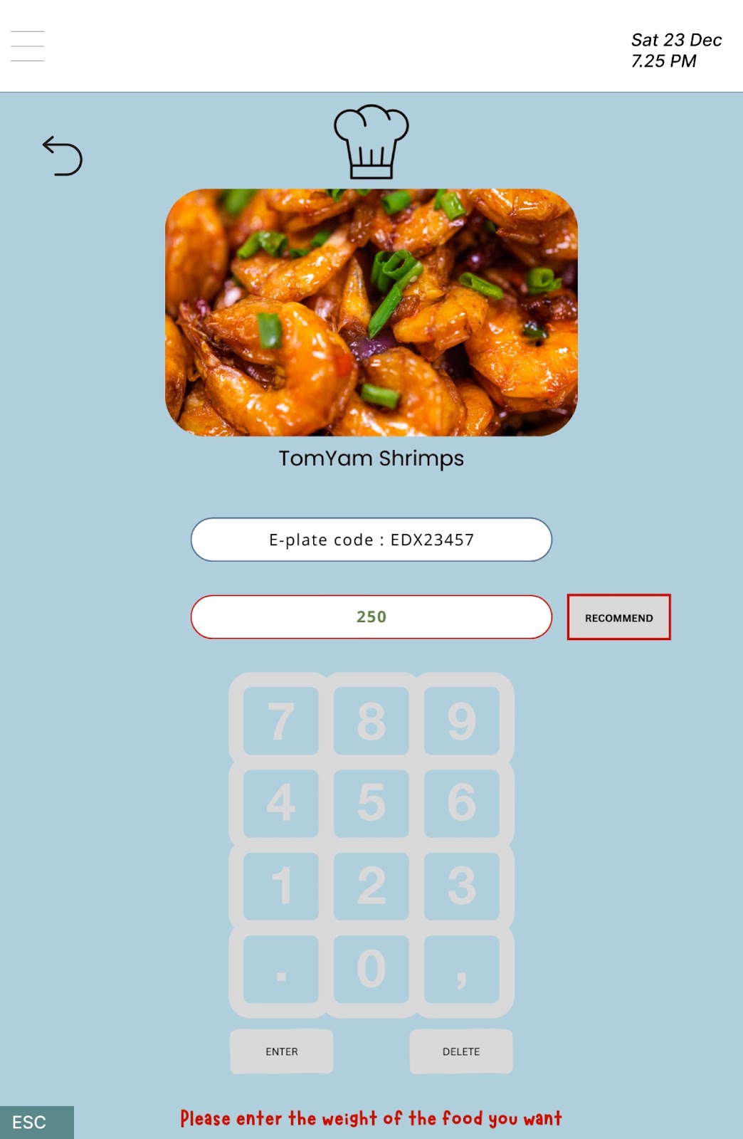
Task 1: Enter the weight Task 1: Error

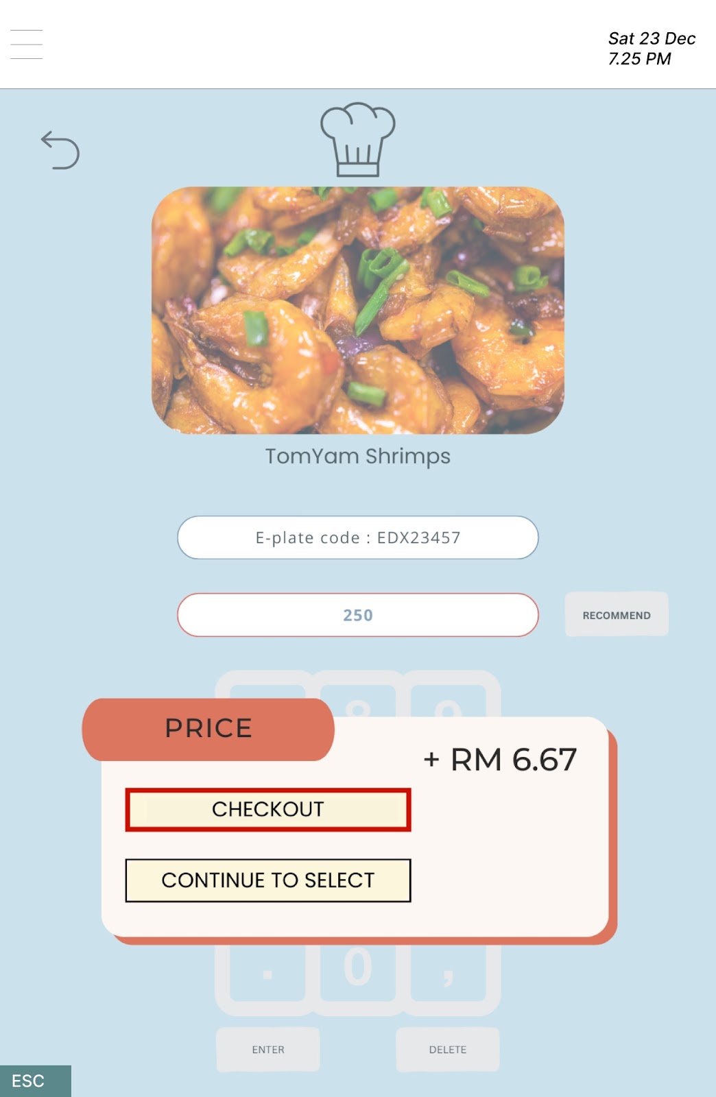
Task 1: Finish entered Task 1: Price of food item shown
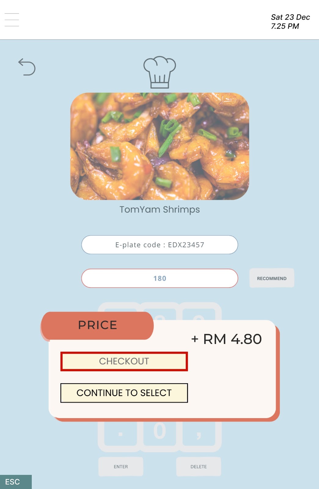
Task 1: Total price shown
🌸~🌸~🌸~🌸~🌸~🌸~🌸~🌸~🌸~🌸~🌸~🌸~🌸~🌸~🌸~🌸~🌸~🌸~
Task 2:
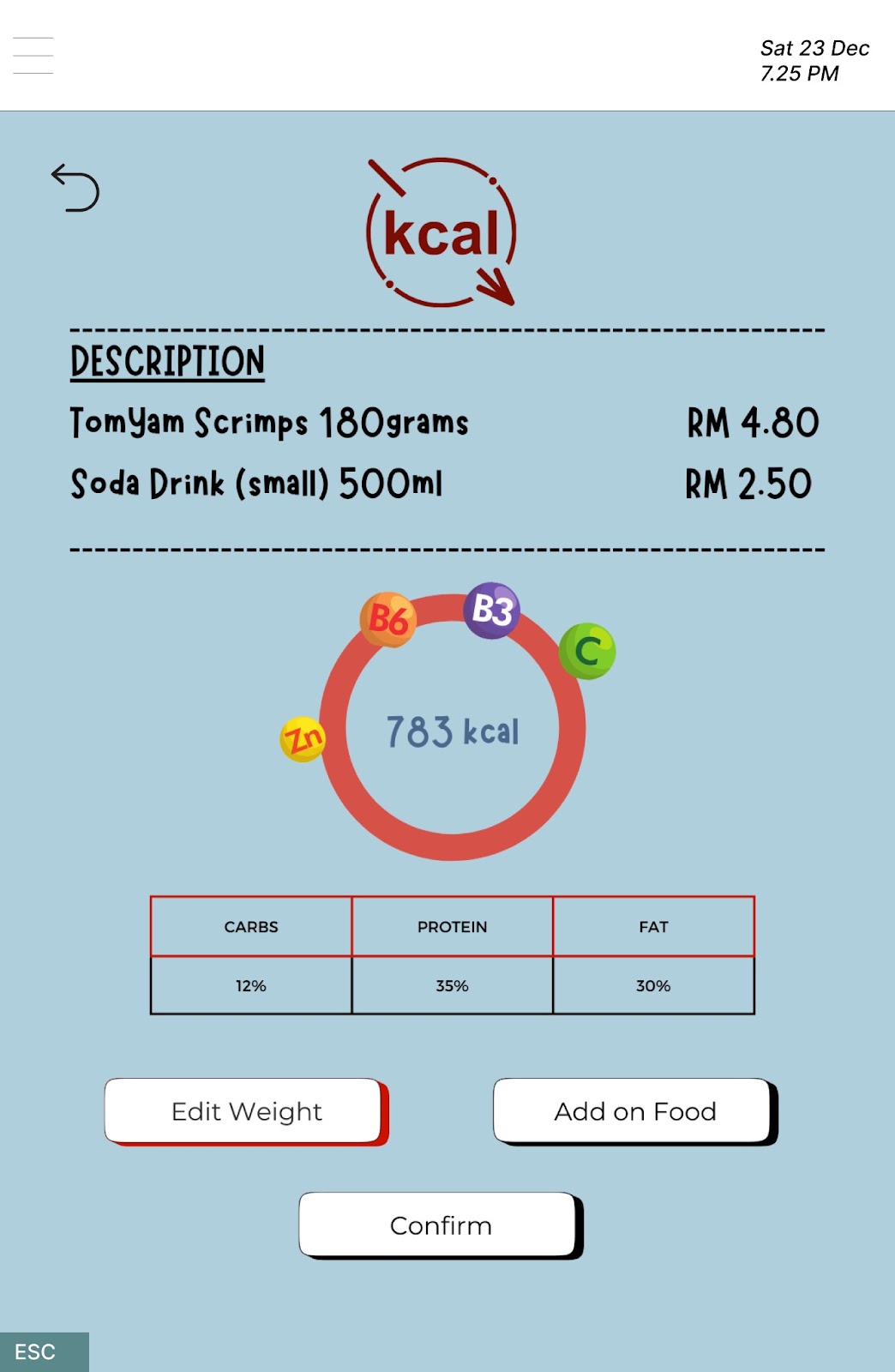
Task 2: Determine the calories intake Task 2: Edit weight

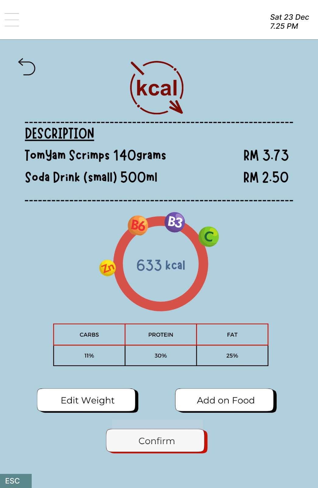
Task 2: After edit weight Task 2: Confirm order
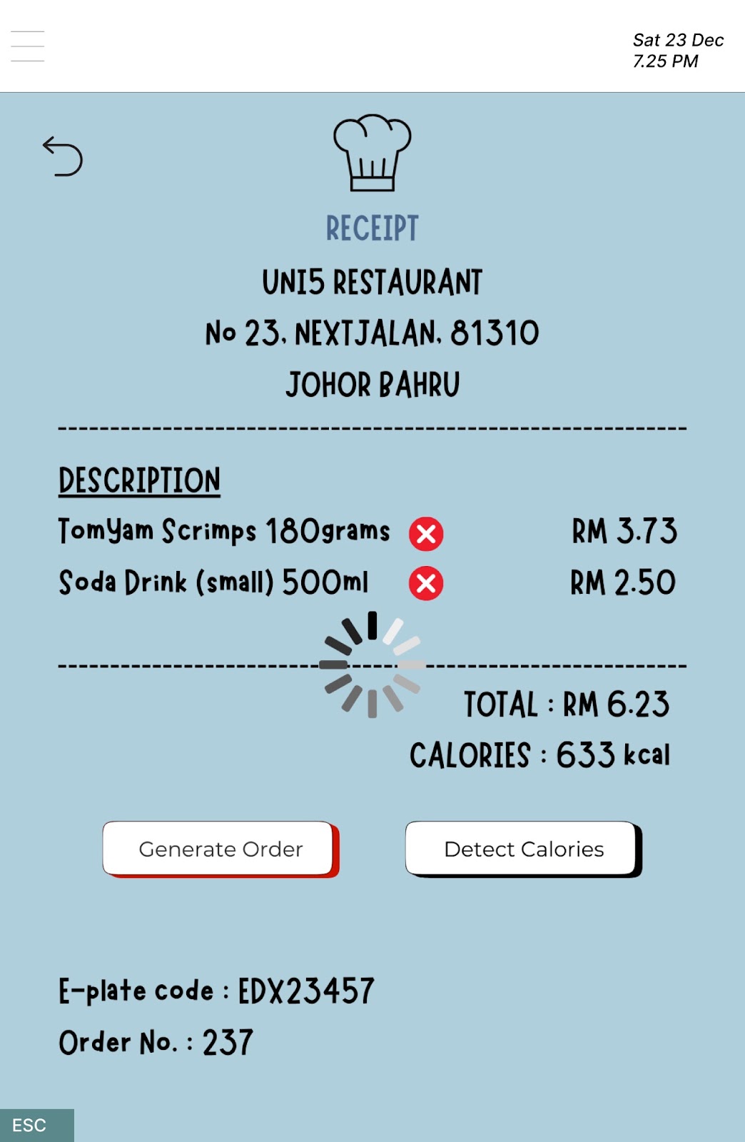
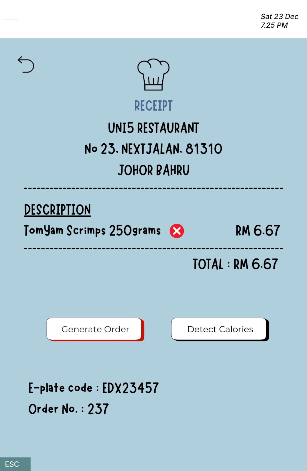
Task 2: Generate order
🌸~🌸~🌸~🌸~🌸~🌸~🌸~🌸~🌸~🌸~🌸~🌸~🌸~🌸~🌸~🌸~🌸~🌸~
Task 3:
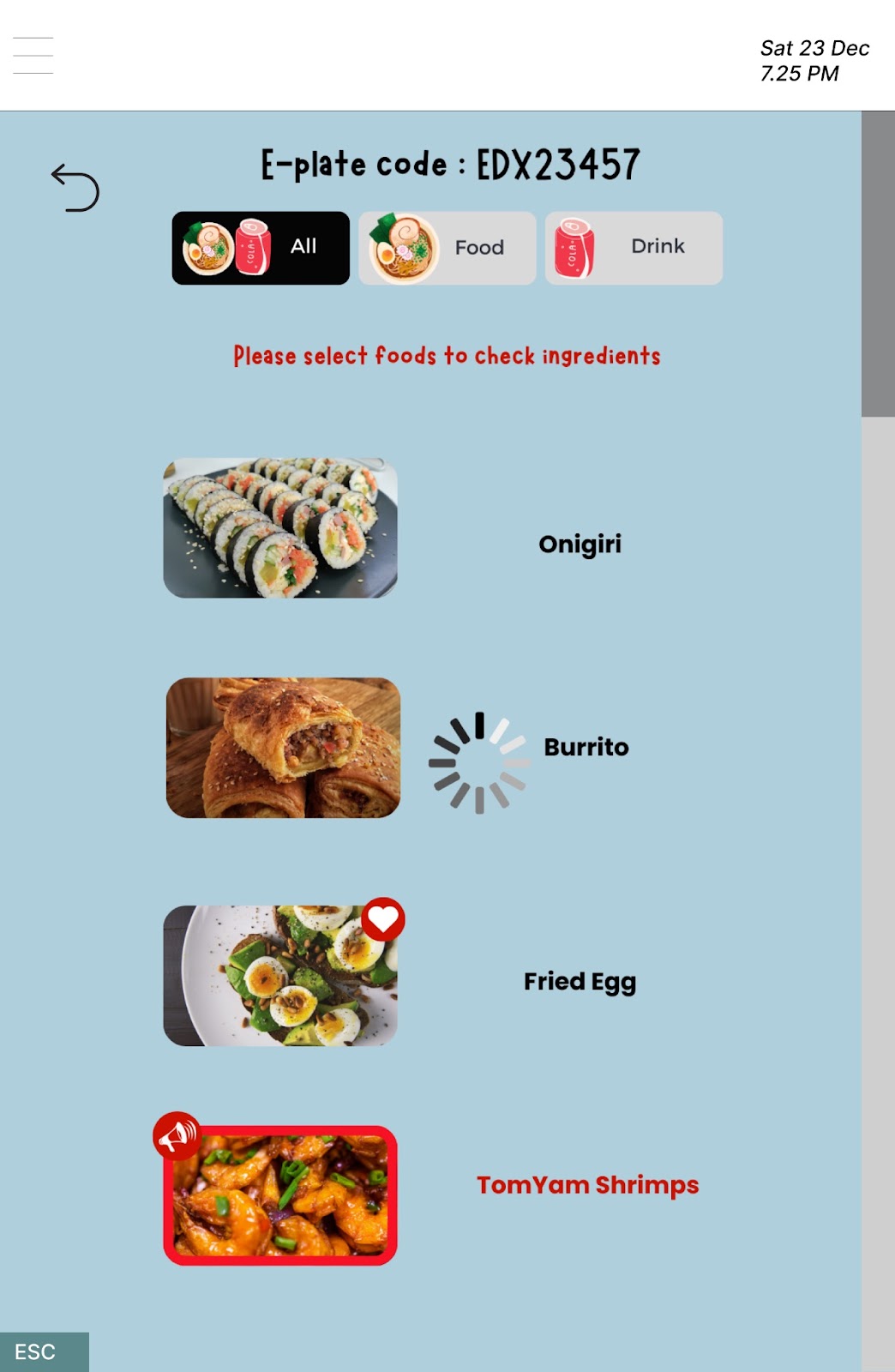
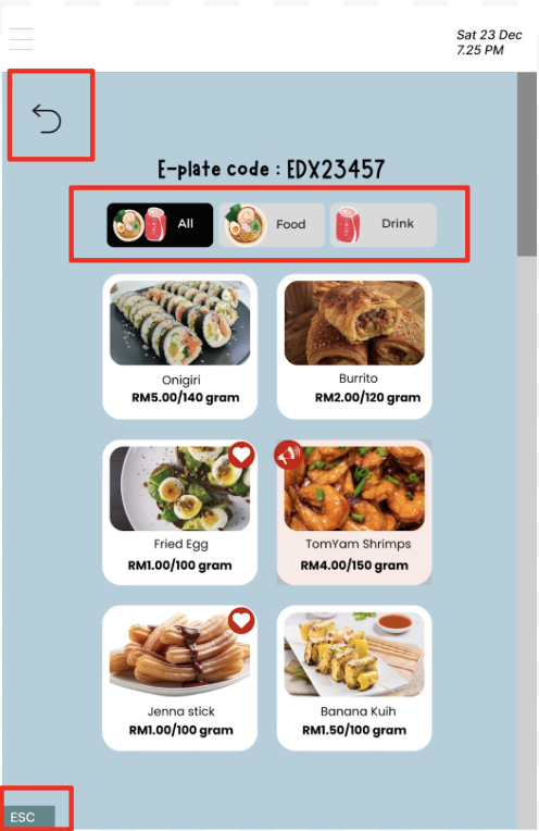
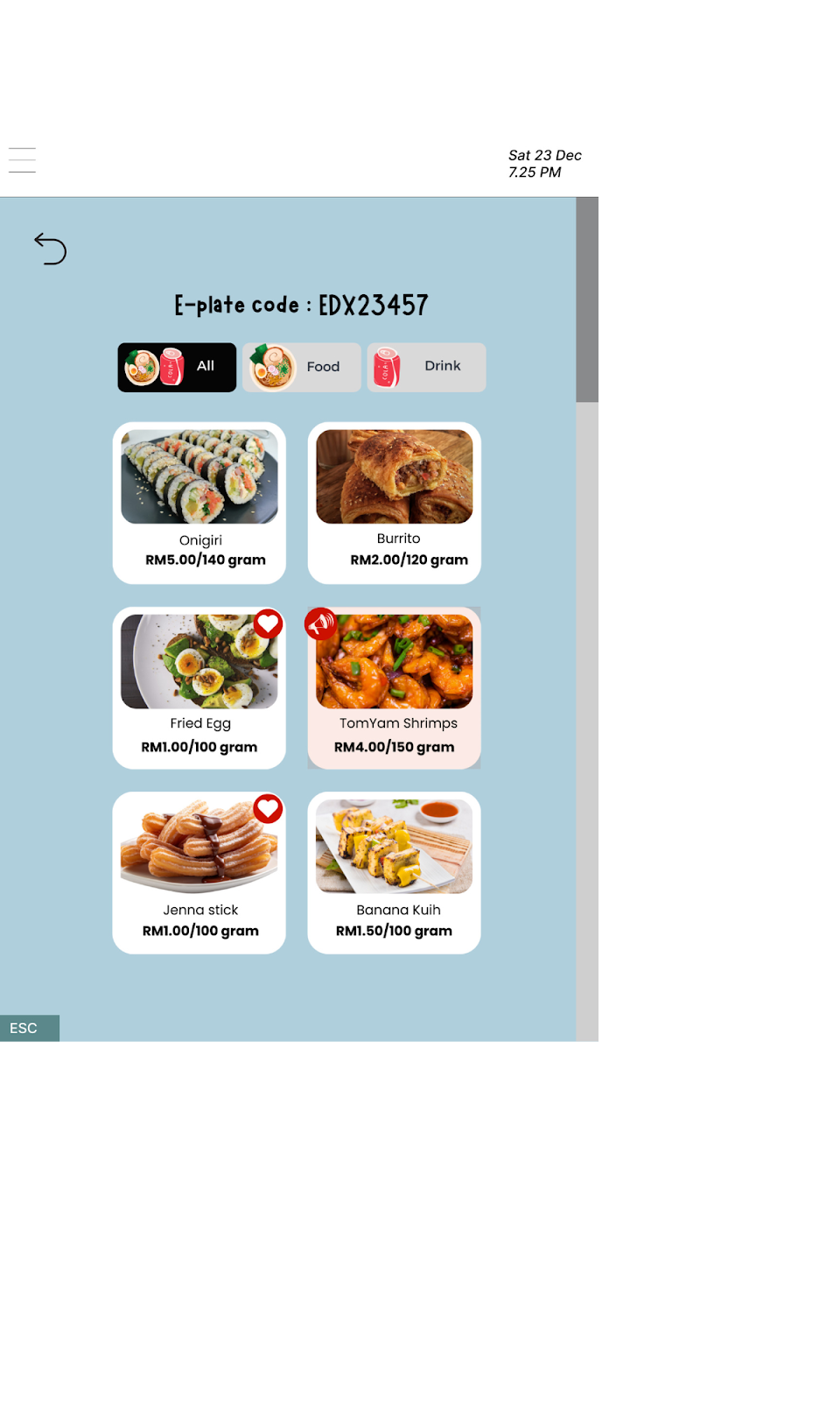
Task 3: View food ingredients Task 3: Select the food item

Task 3: View ingredients Task 3: Continue order

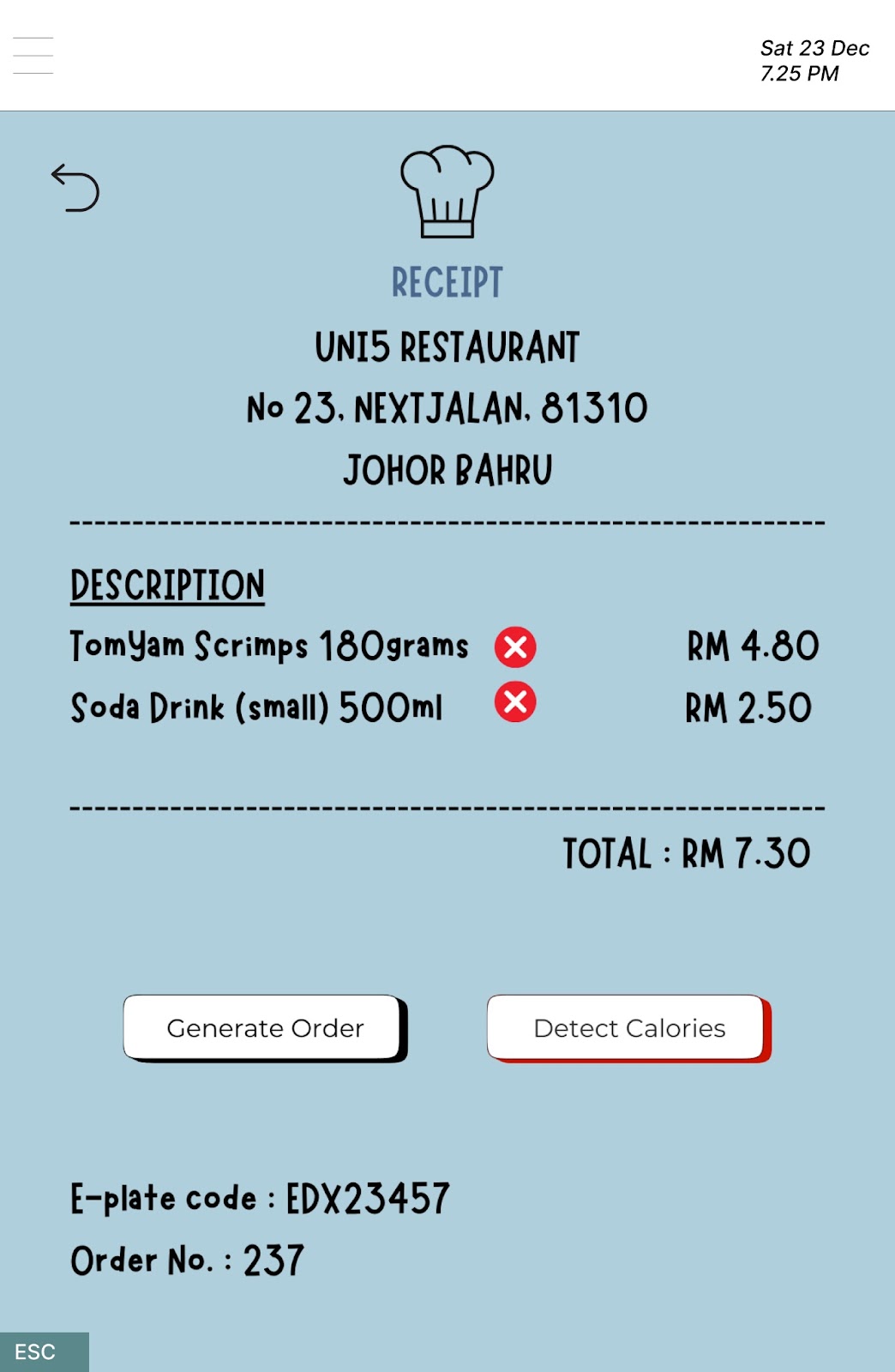
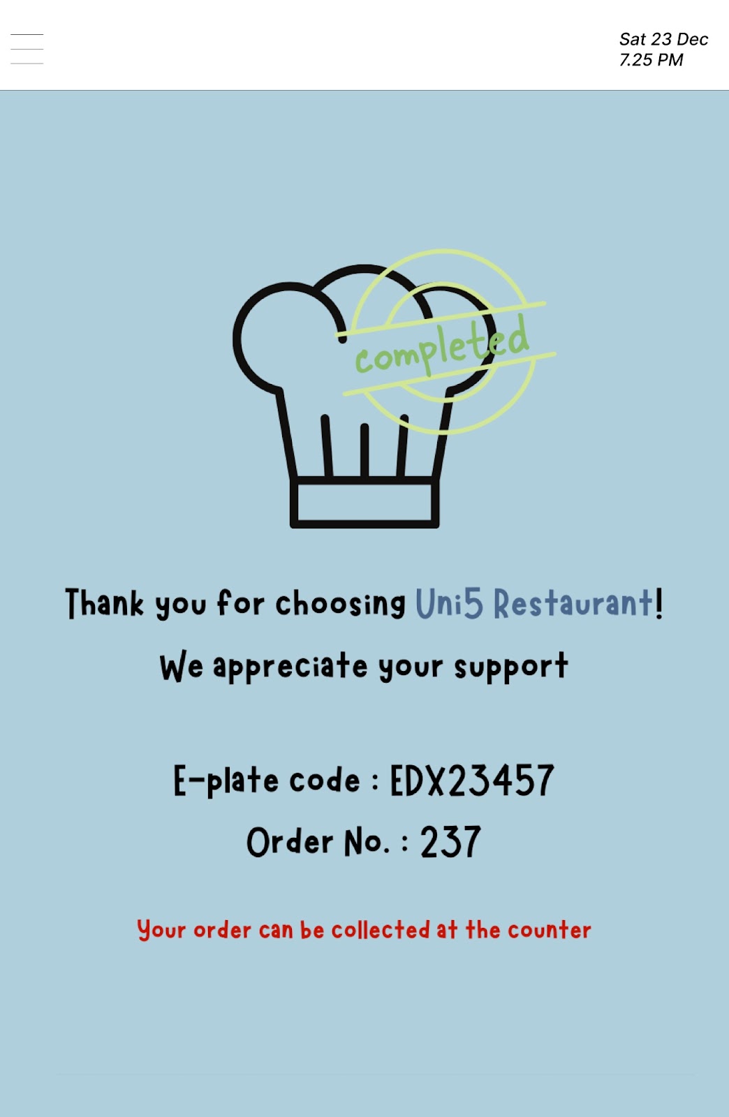
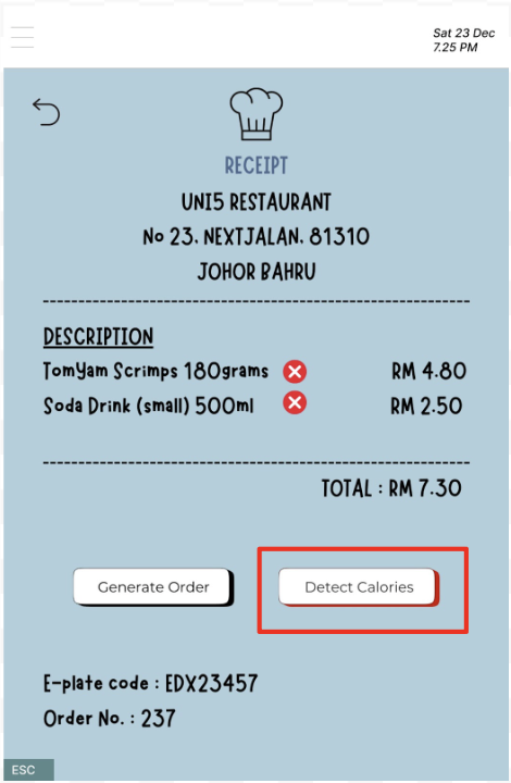
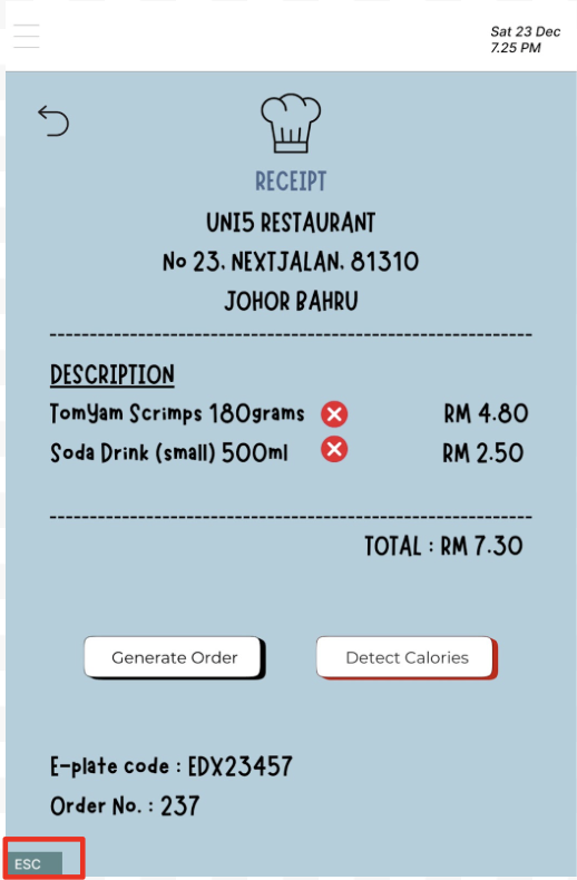
Task 3: Complete order Task 3: Receipt
Justification of Design
Gestalts Principle
1. Similarity
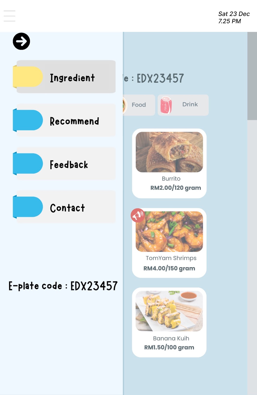
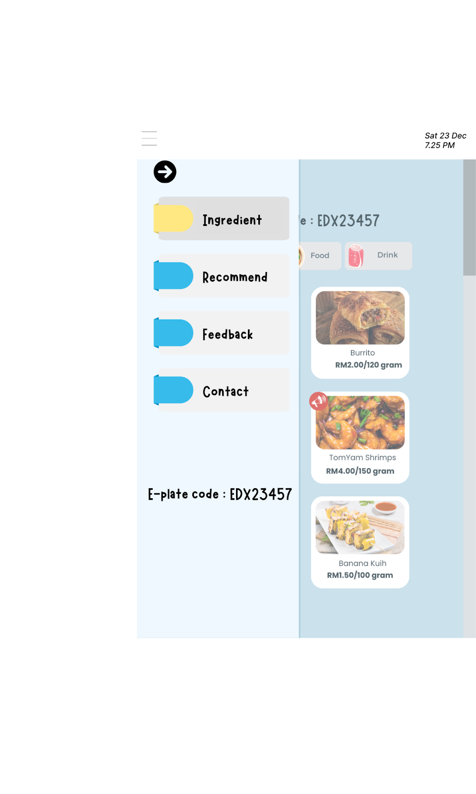
When the hamburger menu icon is pressed, four selections arranged vertically on the left side of this page's interface are revealed. Each selection represents distinct features, but there are clear similarities in terms of shape and the placement of text on the interface. Because of the similarity in arrangement among these four selections, they are considered to be one group and share the same level of function.
2. Proximity
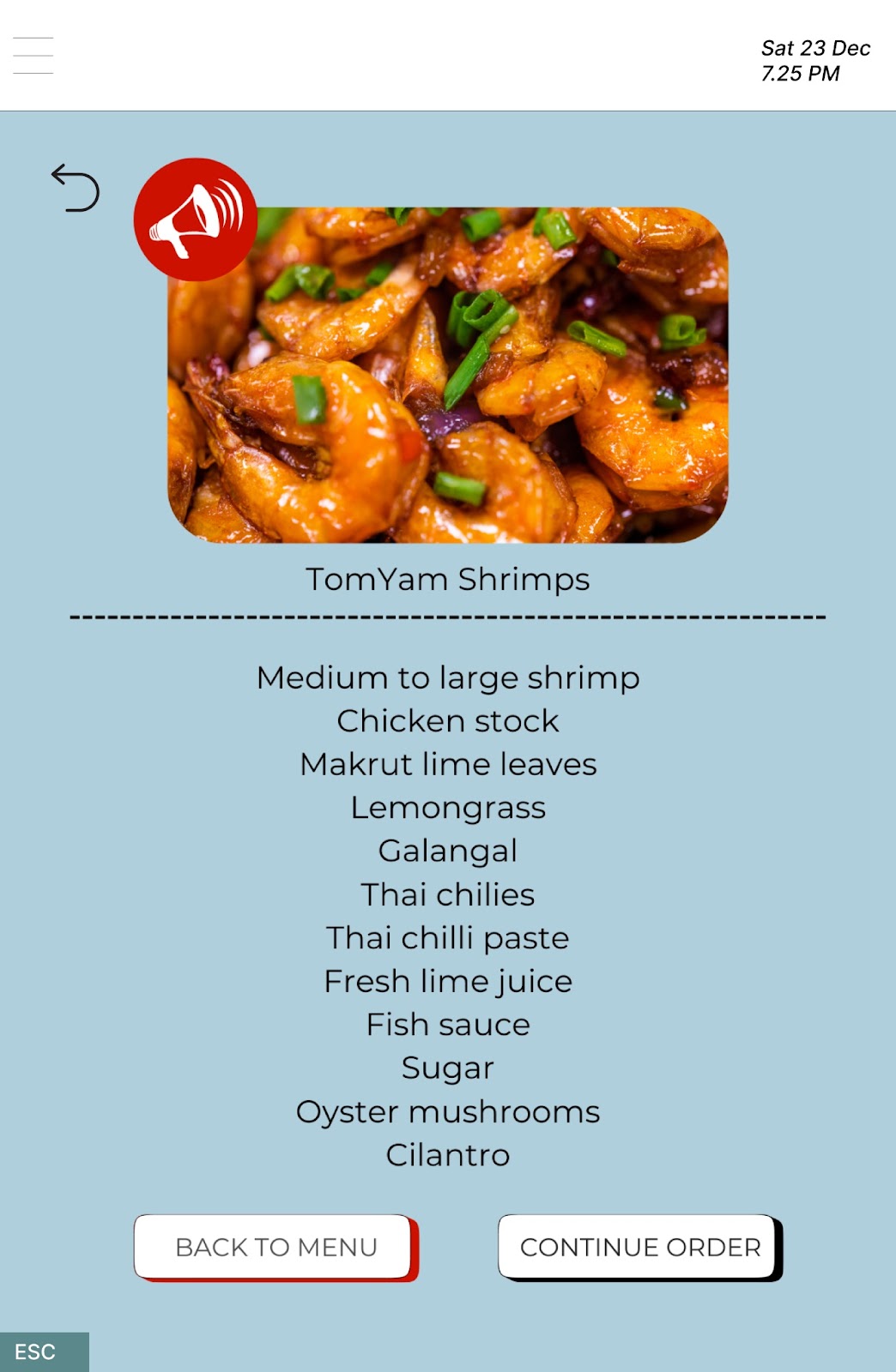
On the interface displaying food ingredients, we added a dashed line and a blank line as components to achieve the dual purpose of separating and establishing the relationship between the food name and its corresponding ingredients. These elements not only establish a clear visual hierarchy for users but also facilitate a quick and easy check for any allergenic foods.
3. Enclosure

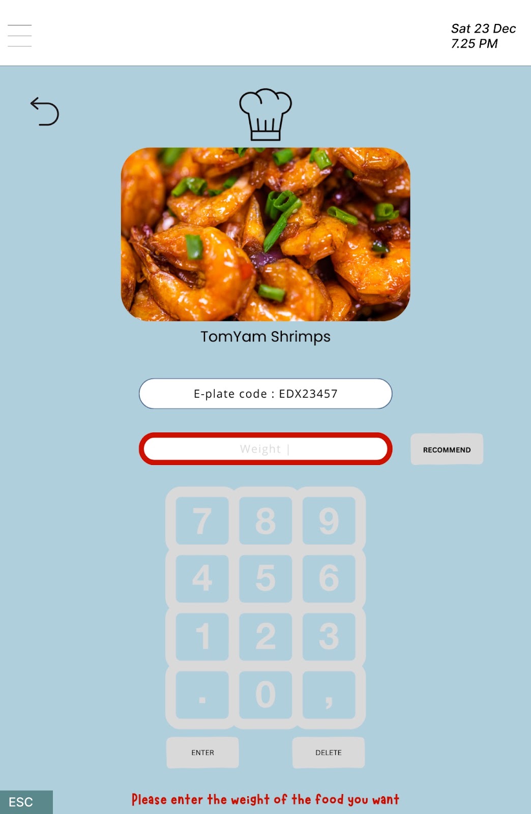
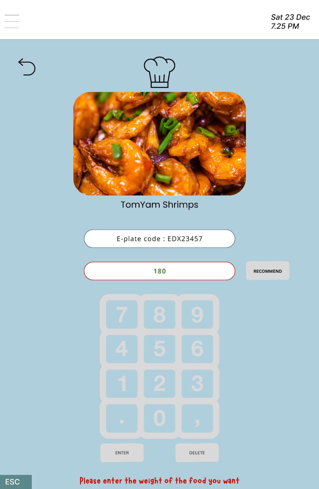
From the diagram above, you can observe that this interface is divided into four distinct areas. The first area, featuring a bordered image of the food, is positioned at the top of the interface. Following this, the second and third areas consist of the e-plate code bar and the weight bar. The final area is the keyboard, which allows users to enter weight and is located at the bottom of the interface. Each of these sections is enclosed by a border, serving the dual purpose of separating them from one another and visually grouping each area.
4. Continuation
To inform users that the machine is processing their order, we've chosen to incorporate a loading icon. The loading icon displays a visually continuous rotation with changing colors, imparting a sense to the user that a background process is underway. This icon effectively communicates to users that they should wait for the machine to complete the processing, reassuring them that the machine is functioning rather than being non-functional.
5. Figure & Ground
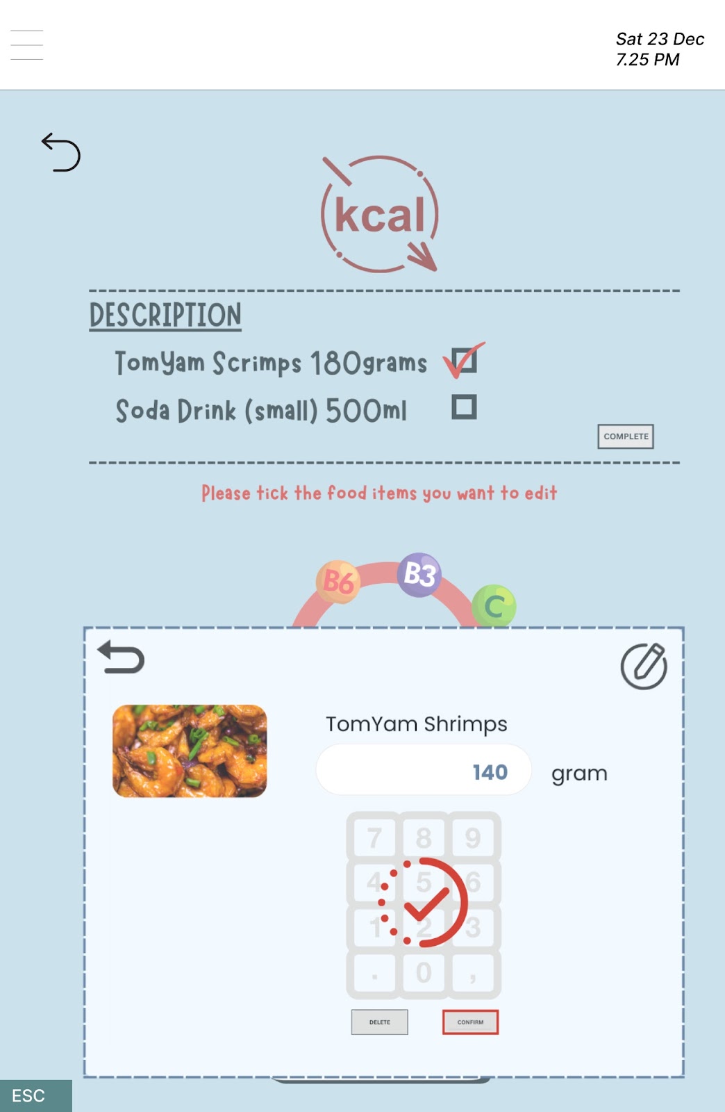
On this interface page, a square box filled with a light blue color serves as the figure, while the background is now in a lighter shade and acts as the ground, providing a subtle contrast to highlight the content. When the user presses the "edit weight" bar, a square box displaying a number pad for editing the food weight is designed. To emphasize the newly appeared square box and capture the user's attention, we made the background transparent and used a brighter color to fill the square box, creating a stronger contrast with the surrounding elements. This ensures that the relevant content stands out clearly against the now transparent background.
6. Closure
We included a return icon on each page except for the first and last pages of the user interface to offer users a convenient way to navigate back to the previous screen. The presence of this icon allows users the freedom to make changes according to their preferences. The return icon is a familiar and common feature in other machines. When users encounter it, they automatically interpret it as a signal to return to the previous screen. This creates a sense of psychological closure in the navigation flow.
7. Experience


In our user interface design, some icons have been incorporated to enhance the user experience and create a more user-friendly interface. Icons such as the delete icon, done icon, return icon, loading icon, like icon, and notification icon are added to the user interface without accompanying label text to justify their meanings. These icons are universally recognized and draw on common experiences from daily life. Hence, users can rely on their prior knowledge to effortlessly comprehend the meanings of these visual elements in the interface.
🌸~🌸~🌸~🌸~🌸~🌸~🌸~🌸~🌸~🌸~🌸~🌸~🌸~🌸~🌸~🌸~🌸~🌸~
Shneiderman's Golden Rules
1. Strive for Consistency
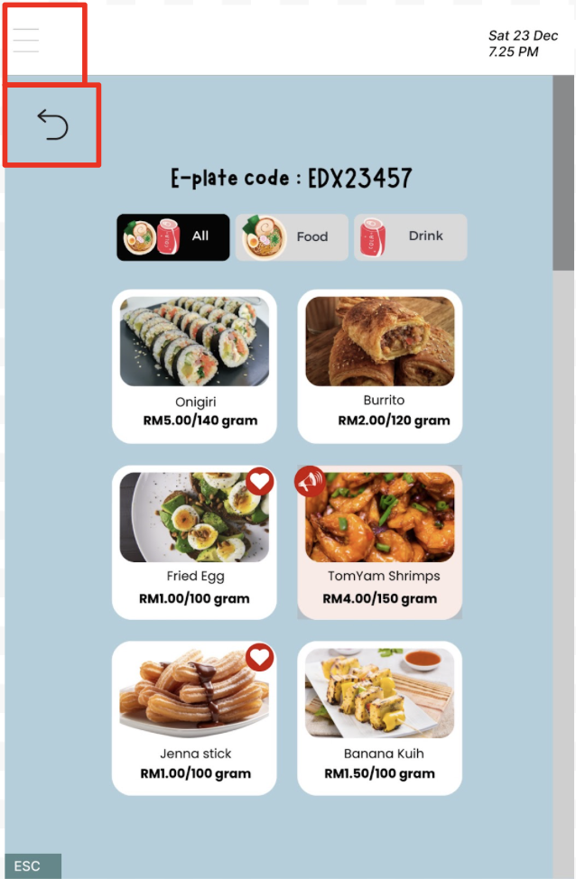
Consistency in design helps users build a mental model of how the system operates and reduces the learning curve. We utilize similar colour and shapes such as rectangles with round corners throughout the pages for display and instructions purposes. Users do not have to learn new icon representations such as a hamburger icon indicating more features provided by the system and an arrow at the top left indicating the function of returning to the previous page.
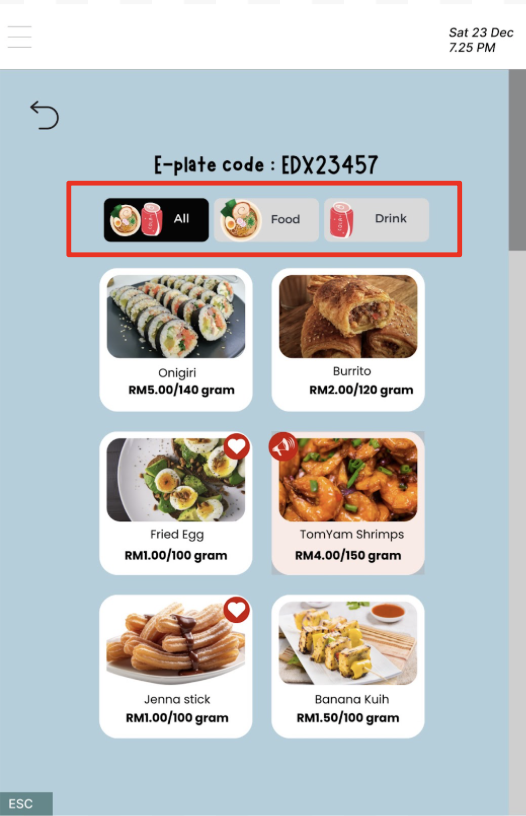
2. Enable frequent users to use shortcut
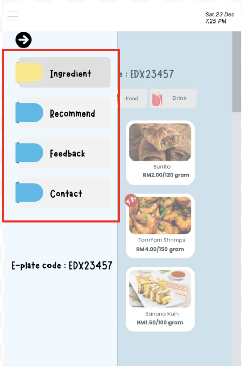
We provide shortcuts buttons on today's menu page so that the users can go to the food page or drink page directly. Besides, after clicking on the hamburger icon, a few options are given to redirect the users to respective pages such as ingredients, recommend, feedback and contact. These shortcuts buttons allow users to access various sections conveniently.
3. Offer informative feedback
When a button is selected, the button will be highlighted in red. Red colour is used as it is eye-catching to tell the users that the button is clicked, waiting for the system to respond. It prevents users from keeping pressing on the button and potentially causing issues such as the system becoming stuck.
4. Design dialogue to yield closure
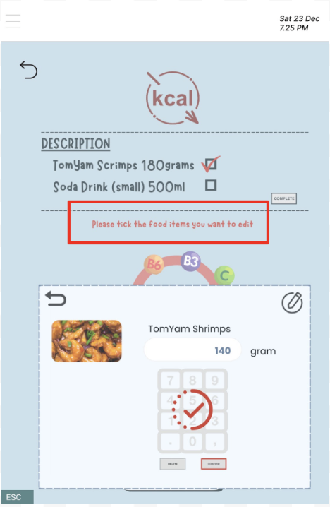
Clear instructions are given to the users so that they know what to do next and avoid them from guessing and making errors. For example, “Please tick the food items you want to edit” guides the users to select the food from the list to change its weight.
5. Offer simple error handling
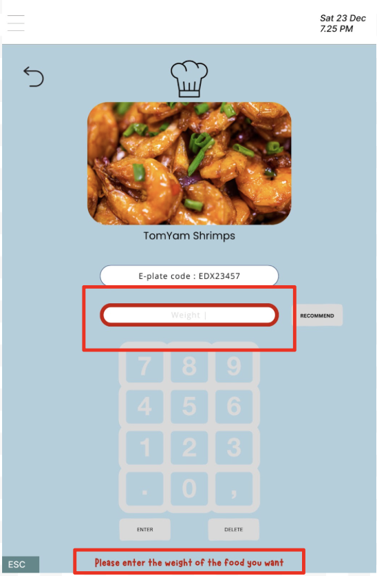
When a user presses ENTER before entering the weight of the food, the input border will be thickened in red, indicating an error occurs. The message below “Please enter the weight of the food you want” will suggest the user to key in the amount of food they wish to have before proceeding to the next step.
6. Permit easy reversal of actions
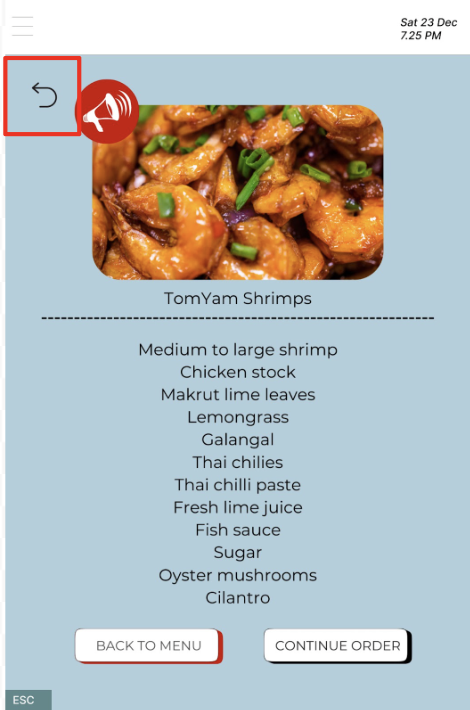
When a user wishes to go back to the previous page, he could just press on the arrow at the top left to reverse his action. This design could reduce users’ anxiety by allowing them to backtrack if they make a mistake.
7. Support internal locus of control
An ESC button is designed to allow users to quit from what they are doing at that moment and will redirect to the main page, waiting for the next user. It gives users a sense of control over the system as the cancellation process is straightforward and user-friendly. There are no complex or hidden steps that might frustrate the users.
8. Reduce short-term memory load

Clear and visible cues, labels and navigation options are provided to help users easily find the information they need without relying heavily on memory. We put relevant icons on the food and drink shortcut buttons on today’s menu page so that the users could easily recognize the food selection and drink selection buttons. Besides, we use precise words or phrases to guide the user to recognize each function embedded in those buttons such as “CHECKOUT” and “CONTINUE TO SELECT”. Moreover, there are some icons that the users are familiar with such as return arrow and ESC button, which leverages users’ existing knowledge and habits, promoting a sense of familiarity and ease of use.
Justification of Metaphors
Scroll bars
The scroll bar serves as an indicator of lengthy pages or content areas, enabling users to navigate within a confined viewing area by manipulating the scroll bar. Users can drag the scroll bar up or down, allowing them to explore various segments of the extensive content within the limited window. The position of the scroll bar, in relation to the entire content, offers users a clear sense of their location within the content areas, facilitating a more intuitive understanding of their position in the overall content.
Return icon and cancel icon
Both the return and cancel icons are functional elements, signifying their ability to assist users in executing specific actions. Clicking on the return icon allows users to navigate back to the previous page, while the cancel icon facilitates the removal of a previously added food item. The consistent usage of these icons across different applications, systems, and websites makes it simple and easy for users to comprehend and learn how to utilize them effectively.
Horn icon and favourite icon
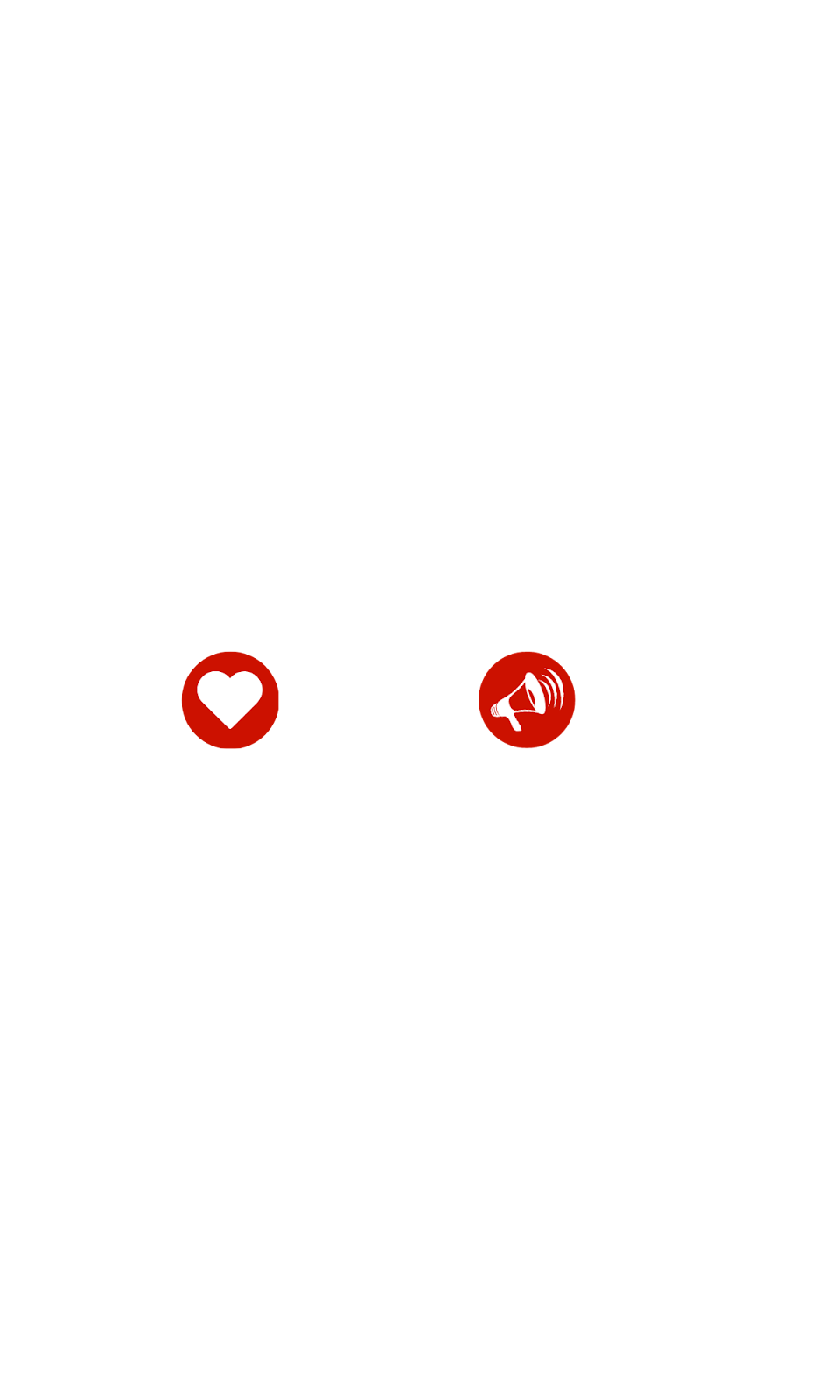
Both the horn icon and favorite icon are visual symbols designed to convey special messages to users as they choose their dishes. The horn icon functions as an announcement or special alert, signaling to users that a special menu is available for the day. On the other hand, the favorite icon indicates user preferences, providing information about the most popular dishes based on the choices of many people. When users encounter the horn icon in the menu, it automatically communicates that the restaurant is announcing a special menu. Likewise, the presence of the favorite icon lets users know that the specific food item is highly favored by others. Consequently, these icons offer users an intuitive understanding, thanks to their clarity and simplicity.
Hamburger type menu
The hamburger-type menu, characterized by an icon featuring three horizontal lines, is typically positioned at the top left or top right corner of the user interface. It serves as a navigational aid, enabling users to access concealed menus. By clicking on the hamburger icon, users can effortlessly expand or collapse the side menu, revealing supplementary options or menus that extend beyond the current view. This design not only provides users with increased functionality and choices within a confined space but also prevents the interface from appearing excessively cluttered. The simplicity of the hamburger icon, a widely used element in various applications, systems, and websites, ensures that users can effortlessly grasp how to access additional options in the user interface.
Phone-like number keyboard
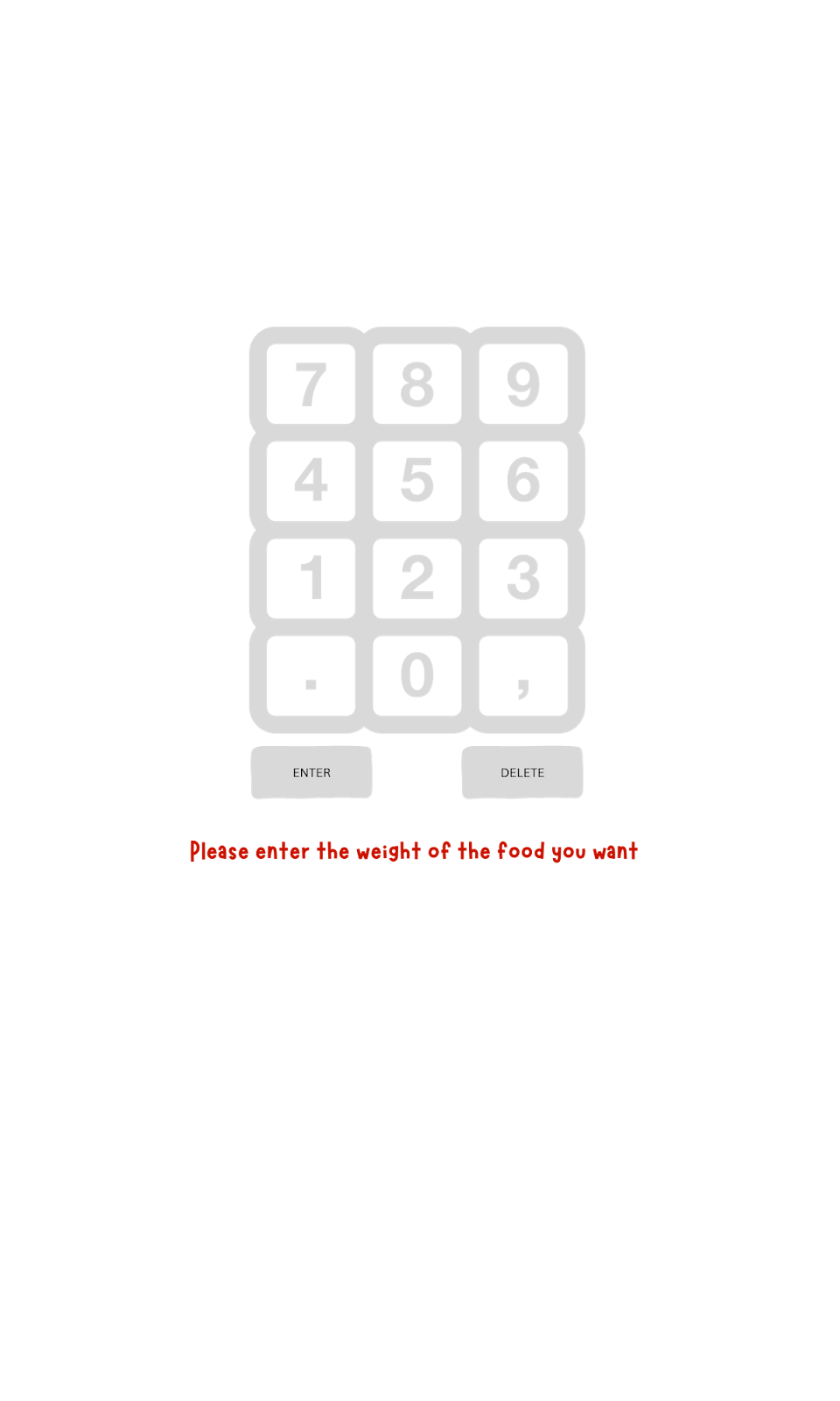
In our design, we've incorporated a phone-like number keyboard to facilitate users in entering the weight of the desired food items. This keyboard mimics the numeric keypads commonly found on mobile phones, leveraging users' existing familiarity with this layout. The recognizable structure and functionality of the number keyboard offer a standardised and familiar approach to inputting numerical values. Upon encountering the number keyboard, users instinctively understand its purpose for inputting weight by interacting with the numbers. Overall, the use of phone-like number keyboards in our design enhances the user experience by providing an intuitive and user-friendly input method.
Popup window

Popup windows serve as an overlay, strategically presenting crucial information that demands users’ attention and action. With a light blue color filling and a transparent background, these windows allow users to swiftly identify, address, and respond to highlighted content. Often utilized to guide users in specific actions, such as inputting information or selecting options, popup windows facilitate tasks like editing the weight of food items and choosing to either check out or continue selecting items. This design element provides an intuitive means for users to comprehend information, process actions, and seamlessly engage with the system.


